I love a good conversation, and Enea from Adoratorio Studio is not only a great conversationalist but also someone whose vision—together with business partner Camilla Zampolini—has shaped one of Italy’s most renowned digital studios over the past decade. I must admit, we could have talked much longer, but I feel we covered a lot of valuable ground in our nearly one-hour discussion. We decided to conduct the interview in Italian, but to help our international audience, here is a fully edited and cleaned transcript of our conversation.
Today I’m delighted to welcome Enea Rossi of Adoratorio. For anyone who has spent the last fifteen years in a fallout shelter, Adoratorio is a major player in the industry I belong to. I don’t want to flatter anyone, but he’s someone I truly enjoy talking with, work aside. We’ve met at various conventions, and I’d like to focus on topics that are closer to our line of work. So, welcome, Enea, and thank you for being here.
I also appreciate that you carved out some time for us. Because of geographical distance and our busy schedules, crossing paths isn’t easy, so having you here makes the moment even more special. You and Camilla Zampolini founded Adoratorio. How long has the studio been active now?
Thanks, Fulvio, and hello to everyone watching. It’s a pleasure to see you again. We usually meet in person, so meeting online is almost a first. Adoratorio officially opened on 17 March 2014, though the first traces go back to July–August 2013, when we were still figuring out what we were going to do. So yes, after twelve years we could call ourselves veterans.
When we started I was 28 years old; now I’m approaching 40 and realise I’m the oldest person in the studio. I enjoy that, because it keeps me connected with younger people and the changes they bring. That connection across generations is an opportunity my parents never had.
I often say I’ve felt 40 since I was 18! I call it “benevolent fatherliness”: having lived through the Flash era as a freelancer, I see similar cycles repeating in younger eyes and it feels tender. For instance, I no longer write code; after years of doing it, everyone in my company is happier that I’ve stopped. I imagine your role has changed a lot at Adoratorio too. What did you actually do at the very beginning?
At the start I literally “made graphics.” I designed brand assets, catalogues, websites; I handled invoices, met the accountant, emailed clients, even posted on social media—everything. Camilla mirrored that multitasking, and we had two interns from my teaching stint at Brescia University. I’m a self-taught graphic designer who gradually evolved into a designer and creative director.
Our first Adoratorio jobs came from a freelance client I could no longer handle alone: we had to create a brand, a catalogue, a website, even a custom configurator. Camilla brought in a wine brand from Lake Garda that paid us in €5 vouchers—we literally cashed them at the bank! Looking back, ten-plus years isn’t that much time, but so much has happened and our roles have naturally evolved.
Nowadays I rarely design. My task is to safeguard the vision—our own and the client’s—so that every project balances values, culture, innovation and brand identity.
“Not Milan” teaser and fiches
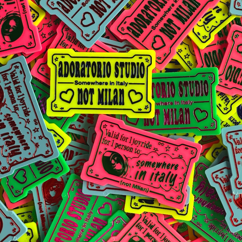
That authorial dimension is obvious in your work: every Adoratorio project has its signature. I also loved your “Not Milan” positioning; being from Udine, closer to Munich than Milan, I get it. I assume it was both a market and spiritual choice.
Exactly. We happened to be born in Brescia, not in a global hub. “Not Milan” began almost as a declaration of independence—gentle, not hostile. People in other provincial cities love it because it validates the idea that creativity isn’t confined to the centre. International clients would ask, “Are you from Milan?” and we’d answer, “No, Brescia—30 minutes away.” For an American that’s practically the same city!
We’ve always wanted to stay a studio, not a big agency, so the slogan also signals scale and humility. Opening in Amsterdam, on the other hand, was a long-standing dream. The city’s size, culture and pace fit how Adoratorio lives and works. We aim to grow personally and culturally, not merely in headcount. Amsterdam offers the right projects and relationships without the big-city frenzy.
I feel the same. For me Munich is more appealing than Milan because it’s built on “old money”—established companies with depth. Even talking to their quiet owners is invigorating. Amsterdam would be the city I’d move to if I left Udine; Boston gives me a similar, human-scaled vibe.
Human connection is indeed the central value of our era. It’s harder in smaller cities but still possible—and vital—to nurture meaningful ties. That’s why we invest time in Amsterdam: conferences led to friendships, which led to opportunities. We take things slowly and let them fit us. Finding office space there is tricky, but we’ve given ourselves two years; patience lets ideas digest and mature.
We share the urge to give back locally. For instance, we restored an ’80s arcade cabinet and installed a tongue-in-cheek “Fricoman” Pac-Man clone in Friulian dialect at a community fair. Kids crowded around a machine objectively worse than any phone game, but the shared experience thrilled them.
Exactly. Quality time and lasting experiences are what matter. Technology itself is never the goal; it’s an enabler. We adopted WebGL, 3-D and physical installations because they served clear strategies and emotions, not because they were trendy. Flash died, but its spirit—rich interactive experiences—has returned under other names. The tool may die; the drive to move people endures.
We recently finished our most emotional project to date—artistic, social, interactive. I’ll share the link as soon as it’s public. It lets visitors participate, not merely observe. That participatory layer is the evolution of everything we have tried to do on screens.
And technology should always serve a purpose. I’m not anti-AI, but without discipline infinite scrolling burns the brain: 7 200 dopamine hits in three hours! There’s no creativity without boredom; we need off-screen time. My team isn’t allowed to read email after five p.m.
I used to work from seven in the morning till two at night; now I disconnect at weekends and encourage the studio to do the same. Downtime replenishes energy and sharpens judgement. My wife is a psychotherapist and works only three days a week so she can process what she has heard on the other two—creatives need similar sedimentation.
I believe “sustainability” in digital isn’t about how green a site is but how long the experience lasts in someone’s memory. Slowing users down enough to feel—that’s almost revolutionary today. Our recent COP 21 project took a dry report and turned it into an immersive story about a changing planet; it deliberately asked visitors to linger.
Exactly. I consider my greatest professional win the fact that I shut my laptop at five and have no computer at home. Off-screen life enriches on-screen work.
Taking care of ourselves means taking care of others. When we created “Child of Time” for our anniversary—a seat-based installation that printed a thermal-paper snapshot of your emotional state—the ink was meant to fade, just like the feeling itself. Those physical-digital hybrids are our long-term artistic pursuit, and that’s why Camilla once said her dream is to see an Adoratorio piece at the MoMA.
A beautiful ambition. When I saw Refik Anadol’s gigantic real-time data sculpture at the MoMA I wept; the technology was breathtaking but the tactile impact moved me. Camilla’s wish isn’t about prestige—it’s about embedding a new form of design into cultural heritage.
Exactly. If one of our works ended up there, it would mean it mattered to society, not just won awards. The physical location is secondary; what counts is what stays inside us—the “inner museum.” Still, yes, I share Camilla’s dream: seeing our installation in the MoMA would show that digital storytelling can be culturally significant.
As the rapper Neffa said, “Ideas are big or small according to the heads that contain them.”
That feels like the perfect closing thought.
Thank you, Enea, for this wonderful conversation. We’ll meet again soon.
Thank you, Fulvio. I hope this was good, valuable time for everyone. Until next time!
When you skim the résumé of Italian service-designer Simone Favarin, two things jump out: longevity and impact. Over a 25-year career he has collected Webby honours and Interactive Key Awards for projects for brands such as Juventus F.C. and IVECO, while steering UX and AI programmes across Europe (Simone Favarin – simonefavarin.com – LinkedIn). Yet his most ambitious creation began only after a late personal epiphany. At 40, he learned that what he had always read as quirks were in fact traits of autism: “For forty years I believed I was neurotypical; then I got an autism diagnosis and switched to ‘neurodivergent’—though of course I had been neurodivergent all along.”
That discovery reframed Favarin’s twin “absorbing interests”—technology and communication—into a mission. “I have two big special interests: technology, and communication,” he laughs, noting that they colour everything from AI-driven cybersecurity to the gems he cuts for experimental jewellery. Instead of narrowing focus, the diagnosis widened his lens: how could design thinking make the online world work for people who, like him, process it differently?
From Designer to Network Builder
The answer is Aspergeronline, a non-profit digital hub Favarin founded in early 2024. “Aspergeronline.org is a connector,” he explains. “We built vertical sites on different spectrum topics, and 99 percent of our content is clinical–scientific: it’s donated by clinicians, not opinions.” The platform hosts free self-assessment tests, a living map of public and private diagnostic centres, and a Discourse-based community whose chat history auto-deletes every 30 days to protect privacy.
Numbers suggest the formula resonates. In its first full year the network drew 338 000 unique visitors, seven hours of average engagement and three million recorded events—on a shoestring, open-source stack. Offline, Aspergeronline’s debut fundraiser packed 1 700 seats in Turin; Favarin recalls stepping onstage and opening with, “I’m Simone Favarin, president of Aspergeronline, and I’m autistic,” and feeling the entire hall fall silent before he delivered two data points that shattered stereotypes.
Designing for Accessibility—Ahead of the Act
Favarin’s design roots give the initiative a rigor rare in the non-profit world. Anticipating the EU Accessibility Act, he warns that “Europe finally woke up and said, ‘you must be more accessible’—yet there are very few designers who even know what that means.” Aspergeronline therefore treats accessibility as infrastructure, partnering with specialised vendors and open-sourcing its own AI-based widgets that translate dense clinical text into plain language.
Community as Agile Project
The project applies product-design sprints to social impact. Fortnightly online meet-ups are moderated by subject-matter experts—but the floor opens after 15 minutes so community voices drive the conversation, busting the myth that autistic people “don’t communicate.” A roadmap for 2025-26 shows the same iterative logic: redesign the site’s UI/UX, extend the diagnosis map to individual therapists, and roll out an AI-trained customer-care bot tuned to autistic communication styles.
Breaking the “Library Job” Stereotype
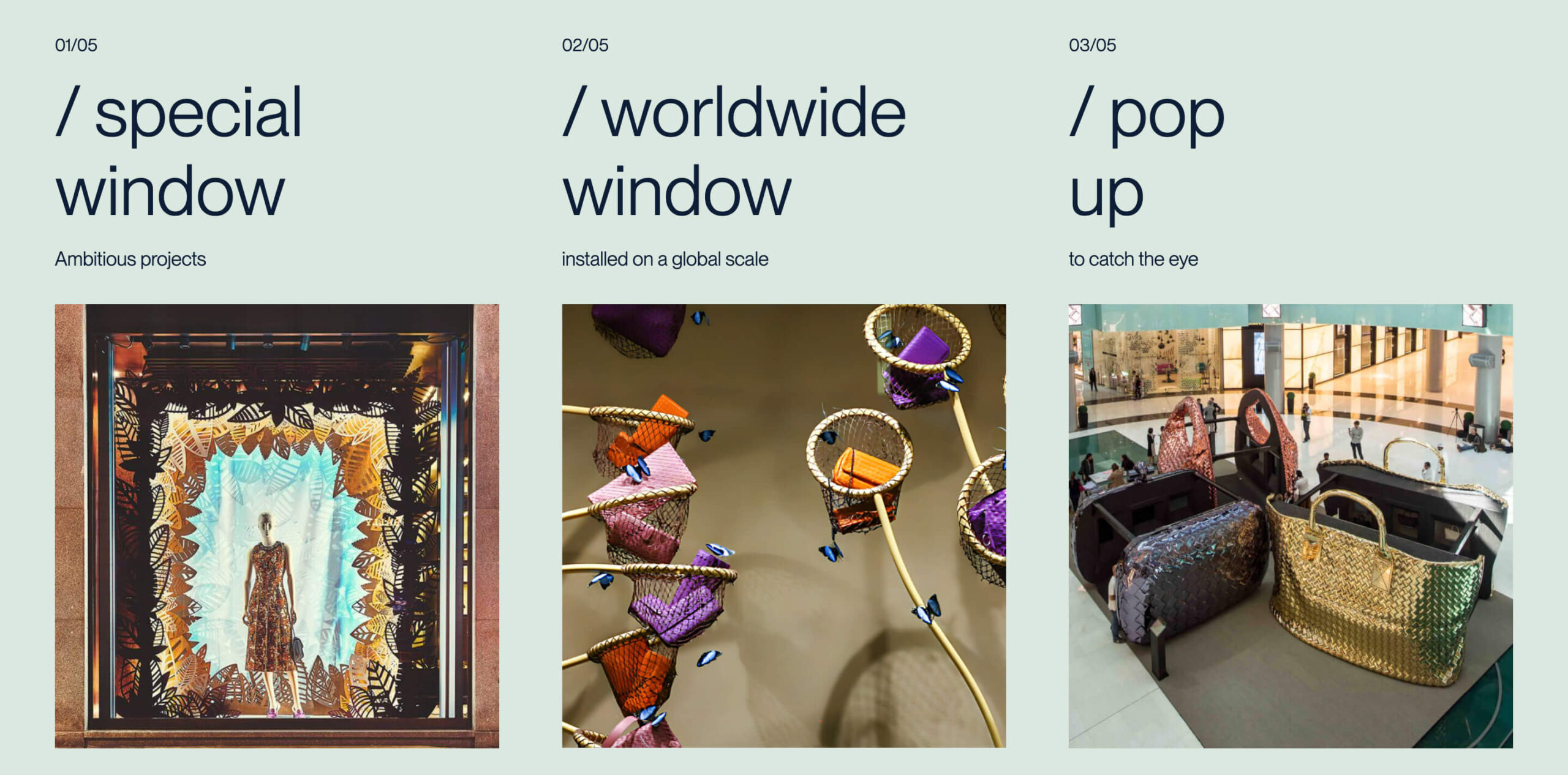
Favarin also fights the notion that autistic talent belongs in back-office cataloguing. More than 90 percent of Aspergeronline’s visuals are generated by neurodivergent creatives using a proprietary Stable Diffusion model, and travel pilots—such as a starlight tour of Italy’s Saint-Barthélemy Observatory—embed autistic contributors at every stage, from itinerary design to cinematic videography.
Why It Matters
In an information landscape still shaped by “Rain Man” caricatures, Favarin’s blend of hard metrics and lived narrative is powerful. “If design is the art of structuring experiences,” he says, “then inclusive design is structuring society so everyone can experience it.” His path from award-winning interface guru (Simone Favarin – Autismo, Spettro Autistico, Neurodivergenze) to outspoken neurodiversity advocate shows how expertise in pixels and workflows can redraw real-world boundaries.
Join the Network
Aspergeronline welcomes members, allies, and professionals worldwide; participation is free, email-list-free, and conversation-heavy. Whether you are a parent seeking reliable diagnostic information, a hiring manager scouting neurodivergent talent, or a designer curious about accessibility, Favarin’s hub offers both the data and the human connection to move the dialogue beyond buzzwords.
“We build the path,” Favarin says, “and then you decide whether to walk it.”
Walk it—and you just might help redesign inclusion itself.
(Photo courtesy of Alessandra Carmen Maria Clerici)
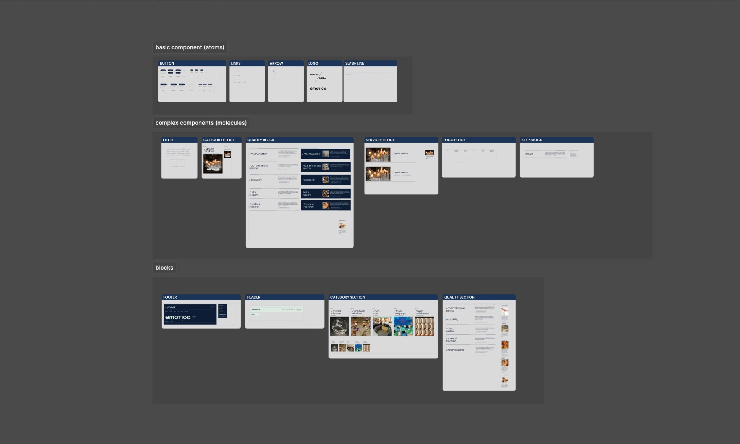
1. The Genesis of Emotica
It all started when Michele Grion and Stefano Zuliani crossed paths at a company specializing in creative installations. Rather than part ways at the end of that shared experience, they chose to build on their combined expertise, giving it a new life through a project that could truly reflect both their visions. Thus, Emotica was born—a luxury retail design firm where technical skill meets pure artistic flair.
The name itself says it all: Emotica stands for emotion. But it’s not just about a fleeting feeling. The goal is to craft experiences that resonate with audiences on a deep, visceral level. Michele and Stefano oversee creative and managerial branches, respectively, merging two distinct perspectives into one cohesive tapestry. They don’t just aim to make something beautiful; they aim to create encounters that leave a lasting imprint on the people who experience their work.
2. Luxury Meets Emotion
In the high-stakes world of luxury fashion, striking visuals and flawless execution are prerequisites. Yet Emotica goes a step further by weaving emotional connections into its designs. It’s about standing out in a saturated market where everyone else is vying for attention. For Emotica, “luxury” isn’t just about the right materials or an exclusive clientele; it’s about offering something genuinely meaningful—bespoke retail experiences that captivate and surprise.
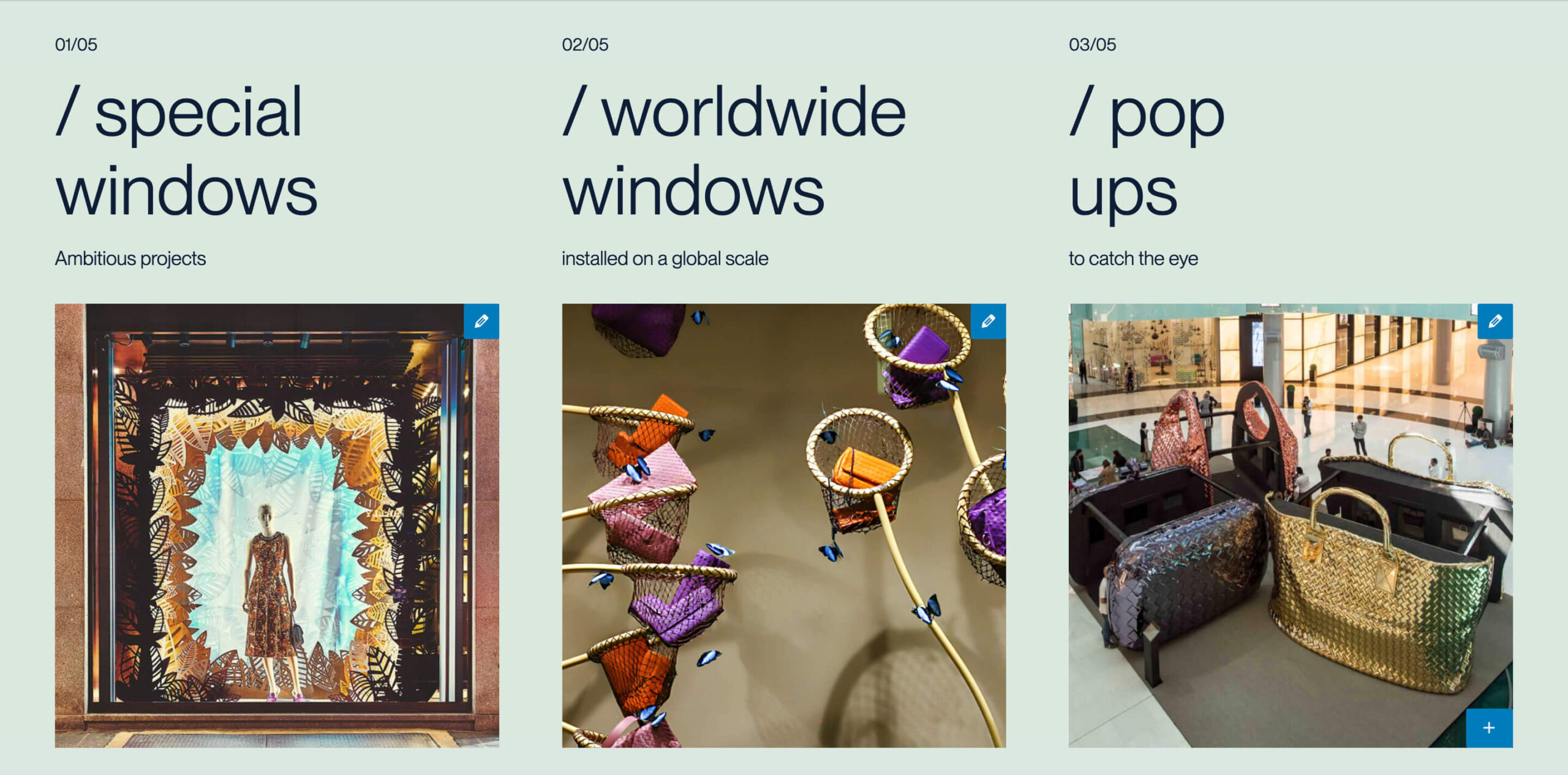
3. A New Way To Imagine WordPress
When the time came to rebuild Emotica’s online presence, we at Ensoul faced a decision: stick with our long-favored, code-heavy approach using Sage, or try a different avenue? Turns out, we chose the latter—and not just any approach, but an experiment that involved the new WordPress 2025 default theme and Full Site Editing (FSE).
Why the switch?
Full Customization – FSE allowed us to modify every single page and template via Gutenberg, opening up an entirely visual approach.
Reduce Complexity – Instead of wrangling with Sage (a theme we do love, but that can be code-intensive), we wanted to see how far we could push WordPress’s native capabilities by creating custom react blocks.
Focus on Blocks – The future of WordPress seems squarely aimed at block-based content, so why not adapt now and build custom, reusable blocks that carry the brand’s flair? This including Tailwind as a framework, full
User Centric Experiences – we are delivering a backend that looks and feels exactly like the frontend experience. Totally the same thing.
We’re all about strategic risks if they promise a bigger payoff, and this experiment was no exception.
This is the difference from frontend to backend. Move the bar to see.
If you can tell.
4. Prototyping: Figma First
We knew the hallmark of Emotica’s site had to be an immersive user experience, complete with fluid animations and a design that shouts “bespoke.” To nail that experience without getting lost in endless lines of CSS, we leaned heavily into Figma prototyping:
Wireframing for Clarity – Every single page layout, from homepage hero sections to intricate product galleries, was mapped in Figma first.
Real-Time Collaboration – Our designers, Elena Guglielmotti and Giulia Fonga, worked in sync, adjusting prototypes on the fly based on feedback from both the Emotica team and our developers.
Minimize Coding Hiccups – By the time we wrote the first line of code, we had a near-complete visual blueprint. This drastically cut down on time spent wrestling with design changes after development had already started.
In many ways, the lines of code were the last step, not the first.
5. Crafting Tailwind and React Blocks
The real star of our new WordPress workflow is the suite of custom React blocks we built, each one styled with Tailwind CSS and designed to be entirely modular. On the surface, that means:
Dark Mode & Reduced Motion – Because not everyone likes bright pages or flashy transitions.
Accessible Code – We’ve baked in accessibility best practices so that elements are keyboard-navigable, ARIA-labeled, and screen-reader friendly.
Animation via GSAP – Subtle yet elegant transitions that reflect Emotica’s flair. Think parallax scrolling, fade-ins, and micro-interactions that invite users to explore.
Horizontal/Vertical Scroll Toggle – For that extra design punch, certain pages allow toggling between horizontal and vertical scroll, all editable within the Gutenberg interface.
Text from this example below is directly editable, so to say. Minimal controls and full Gutenberg capacity.
From a client’s perspective, these blocks are a breeze. Emotica can build new landing pages on the fly, customizing everything from color schemes to layout without writing a single line of code. That’s a game-changer for a brand that thrives on creativity and agility.
6. Why It Matters for Ensoul
Adopting this new approach took us out of our comfort zone. We’ve relied on Sage in the past for high levels of customization, but WordPress’s Full Site Editing and custom block ecosystem have finally matured enough to handle complex projects with style. This transition:
Streamlines Our Workflow – Less time building custom themes from scratch means more time refining the user experience and visual design.
Empowers Clients – By giving clients like Emotica the tools to update, tweak, and experiment, we free them to focus on storytelling rather than bugging us for every little change.
Boosts Performance – Our Tailwind-based blocks integrate seamlessly with the 2025 theme, ensuring that performance scores remain top-notch in Lighthouse and other testing tools.
And perhaps most excitingly, this is only the beginning. Emotica’s site now serves as a template for future Ensoul projects. Our ultimate goal is to keep evolving these blocks into a robust library—flexible enough to accommodate multiple industries yet distinctive in craftsmanship.
This is like our WordPress backends look like in 2025. So fresh, so clean.
7. Looking Forward
Emotica’s story is still unfolding, both as a design firm and as an evolving brand identity. For our part at Ensoul, this project marks a milestone in how we’ll approach WordPress development moving forward. We’ve glimpsed the future of site-building: more Figma prototyping, more AI-empowered content curation, and more custom React blocks that unite visuals, functionality, and accessibility.
What’s next? We plan to keep refining the block library, experiment with new animation libraries, and deepen our understanding of WordPress’s Full Site Editing capabilities – we already created a new . We’ll also continue leveraging AI to unlock more profound storytelling possibilities for clients. After all, technology should support human creativity—not the other way around.
Ultimately, Emotica’s digital home stands as proof that risk-taking and innovation can lead to something remarkable. It’s a beacon for anyone who wants to blend art, code, and raw emotion in a single platform. And for Michele and Stefano, it’s the perfect online canvas to showcase how luxury, design, and heartfelt storytelling converge under one roof—an invitation for future clients and collaborators to share in their vision.
If you’re curious about how we built this or want to explore new ways to align technology with emotional resonance, drop us a line.
In an age of hyperconnectivity, few roles are more paradoxical than that of a community manager. Tasked with cultivating online spaces that feel human, warm, and cohesive, they must also fend off trolls, speculators, bots, and burnout. In his conversation with Ensoul’s Diary, community expert Rok Gorjan offers more than an introduction to the mechanics of digital community-building—he opens a door into the emotional and psychological underworld of a profession that demands infinite empathy in a world of finite mental resources.
Rok Gorjan, based in Ljubljana, has turned his passion for human connection into a craft. From his early days managing reggae enthusiasts to now orchestrating vast Web3 communities—at one point moderating a Discord server with 2.5 million users—Gorjan embodies the transition from subcultural passion to high-stakes digital architecture. But his story is not just about scale and strategy. It’s about the cost of connection.
“My worst scenario is to run a large server which is quiet,” he says. This isn’t just a fear of failure. It’s a fear of emptiness in a space designed to pulse with life.
In Rok’s world, moderation isn’t just about silencing the bad actors. It’s about identifying personas, nurturing relationships, reading intent before it’s spoken aloud. “People don’t always have to relate to the project,” he observes. “But they have to relate to the moderator, or they are gone.” His work hinges on emotional intelligence, cultural fluency, and an ever-vigilant sense of safety—because in Web3, security isn’t metaphorical. “Once you get hacked or lose control in any other way, a lot of trust just evaporates instantly.”
Yet even as he builds these safe, scalable ecosystems, Rok found himself quietly burning out—an experience he didn’t see coming until his body gave out. The community manager, ever-present and online, often ignores their own needs. And when the crash comes, it’s brutal.
He describes a year of symptoms: twitching muscles, crippling vertigo, days-long headaches, and the quiet terror of Googling oneself into imagined brain tumours. The diagnosis was clear: burnout. Not the kind romanticised in startup culture, but the medically recognized adrenal collapse that comes from working insane hours a week in a state of chronic stress.
There’s something deeply poetic, and equally wrong, in the idea that someone whose job is to foster belonging and human contact can end up isolated by their very success. “Because when you’re surrounded by 20 people that work 90 hours per week, you start to think it’s normal,” Rok reflects. And it is, in a way, the dark symmetry of today’s digital economy: the more connected we are, the more invisible the cost becomes.
But the truth is, digital communities rise or fall on the invisible scaffolding community managers construct. They are the firekeepers of digital culture, responsible not just for onboarding and engagement, but for protecting trust, reinforcing identity, and cultivating what Rok calls the “positive spirit” of a place.
And that positive spirit isn’t algorithmic. It’s relational.
This disconnect between emotional depth and surface metrics is what drives many community professionals to the brink. KPIs (Key Performance Indicators) reduce community health to numbers—retention, activity, engagement. But, as Rok points out, “I’d rather have a community of 3,000 engaged people than 300,000 where only 300 are active.” Unfortunately, the VCs and stakeholders who finance Web3 dreams often think otherwise.
What’s striking about Rok’s testimony is that even in a burnout spiral, he kept working. He didn’t disappear. Instead, he moved to the seaside, scaled back his hours, stayed transparent with his team, and started healing. But his recovery wasn’t just physical. It was philosophical. It required him to question everything—from his work ethic to his family boundaries to his own addiction to digital presence.
This reflection leads to another crucial insight: community managers don’t just build for others—they live in what they build. And when that digital habitat becomes toxic or all-consuming, they suffer first.
In today’s culture of hustle and hyper-growth, Rok’s story is a reminder that the people behind our screens—those “always on” moderators, community heads, and support managers—are not invincible. They are as human as the communities they serve.
Burnout is not just a personal failing or an isolated event. It’s a structural byproduct of systems that undervalue emotional labour, celebrate overwork, and ignore the cost of being constantly available.
As digital societies become more entrenched in our lives, the people who manage them are quietly shaping the future of how we relate to each other online. Let’s ensure that in doing so, they don’t lose themselves.
Rok Gorjan didn’t set out to be a community builder. But he’s become something of a philosopher of connection—a voice reminding us that communities, like people, are fragile. They grow when they are nurtured. And they fall apart when we assume they can run forever without rest.
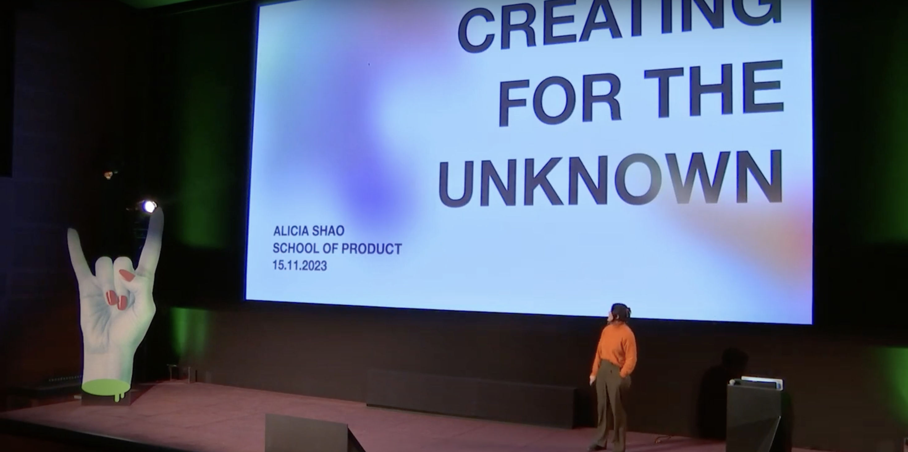
“Alicia Shao is a Senior Service Designer at The LEGO Group, an external lecturer at the Köln International School of Design and L’École de Design Nantes Atlantique, founder of Future Unfurled and a most importantly, a futurist at heart”.
Her brief bio is concise as relevant: I stumbled upon her teachings in Amsterdam, at the October 2024 Awwwards, and I found in her words not only inspiration but also that kind of hope that, in our dystopic times, fuels life and creativity. I contacted her after the conference and asked if we could interview her. She was extremely kind, and here are her answers.
Future is one of my favorite topics: some time ago, I stumbled upon an intriguing statement—there are numerous animal species with language, sometimes very rich and sophisticated, but the only species that, as far as we know, has a future verb tense and the very concept of the future embedded in its language is humans. This is said to have provided a greater evolutionary advantage than the opposable thumb, which we share with other primates. Interestingly, in Italian, it’s becoming increasingly common in conversations to avoid the future tense (“I will go to the cinema tonight”) to describe future actions, favoring the present tense instead (“I’m going to the cinema tonight”), as if stating something in the future appears naive or fragile, while affirming it in the present makes it feel already realized. What do you think about the status of the “future” as a concept in media culture?
That’s such an interesting question! There are studies show that language really shapes how we see time, which then affects how we think about the future. In English, for example, we tend to see time as linear, and we also talk about time the same way we talk about money. We “spend” time, we “save” time, we hope something is “worth our time.” I think the abstraction of time extends to our abstraction of the future, since future is just time yet to come. Through the abstraction of time in our language, we have commodified the future, turning it into something to manage or control rather than just experience.
If we consider media its own language, you find some trends of commodifying future there too. The future isn’t just something we imagine, it’s something we consume. Sci-fi movies, dystopian thrillers, futuristic worlds… they don’t just explore what’s possible; they package the future as entertainment. I am speaking generically here about media portrayals, but it’s often more about the spectacle than the substance. We get the same cyberpunk cityscapes, AI villains, space colonization stories, but they rarely push us to rethink the present. The future becomes a genre, something predictable, rather than a space for real imagination.
For the records I would watch a blockbuster sci-fi movie any day, it is just when the future is commodified as idle entertainment, it can feel distant, predetermined, or out of our hands. It’s easy to consume these visions without questioning them, but I think the real power of the future is using it as a tool—to reflect, to challenge, to guide what we do now.
A very moving article published recently highlights how difficult it is for us to feel empathy for future generations. In some countries, declining birth rates have become a conscious and even desirable choice. In your discussions, do you sense a prevailing desire for an individualistic future rather than a collective one?
Another great question! At first glance, it seems impossible to feel empathy for future generations who doesn’t exist, and may never exist. But this is not a unique issue – In Imaginable by Jane McGonigal, she talks about the issue of people perceiving their future selves in third person, as when you think about yourself in 10 years, most people imagine another person standing in front of them, that looks like them but older, instead of seeing it from a first person perspective. It seems that we can’t even empathise with our own future self and imagine them as another person all together. But despite these evidences, we actually feel empathy for non-existent people all the time.
We laugh and cry with fictional characters in TVs and movies, we feel a sense of longing and melancholy thinking about the person we were or could’ve been. There are 2 kinds of empathy when we talk about the future, emotional empathy and cognitive empathy. Emotional empathy refers to the ability to literally feel what another person feels, while cognitive empathy refers to the ability to understand what another person feels, without necessarily feeling it yourself. An example of this could be that you understand why your friend is frustrated by a situation they are in, without feeling the frustration yourself. However cognitive empathy is less intuitive than emotional empathy, it requires conscious effort to cultivate. I think the first step is always learning to build our cognitive empathy for our present environment, empathising with the complex and sometimes contradictive attributes of the people from around us. Then, moving onto building empathy for our own future self – start seeing our future selves as an extension of you right now, rather than from a 3rd person perspective, and finally, we can move onto building empathy for the collective at large. The final piece is much easier said than done, in my classes, I have an exercise where I get all the students to write a diary entry on the same day of as someone living in whatever future we are designing for. Then, we have a diary reading session where we review all the multitudes and complexities that one day may have. This really helps the students see the future and these future people as something more “real”, because they see that the future is just as complex and multi-faceted as our present reality. I think empathy for the collective is not only needed but crucial, because after all why should you pay more for sustainable products, or give up eating meat, or drive an electrical car for someone that doesn’t exist, may never exist, and will not do a single thing for you? Building empathy for the collective is what will help drive behaviour change especially when we talk about future generations.
Science fiction has helped shape our present as the dreamed future of its writers—the inventor of the mobile phone (not the smartphone, the actual mobile phone) openly admitted to being inspired by the tricorders in Star Trek. However, there now seems to be a shortsightedness about the future; the visions we are presented with are often dystopian or cold, whereas I was captivated by your comments at Awwwards about a “future inevitably warm and not bloodless, because it is born of our breath.” One of my theories is that many people have stopped believing in a different future because the current state of things feels both inevitable and, at the same time, desirable: in a Western context where people generally live with dignity, the fear of losing stability outweighs the drive to find new solutions, leading to economic monopolies and populism. In other cultures, social mobility is simply not possible. Does this resonate with your experience? Do you have any other perspectives you’d like to share?
I think this question greatly relates back to the part about empathy for the future. I don’t believe we’ve lost the ability to imagine a different future, it’s just that the dominant narratives we consume oscillates between two extremes, either we’re headed toward technological utopia (AI saving humanity, space colonization, etc.), or we’re spiralling into dystopia (climate collapse, authoritarianism, AI taking over). It makes sense that when we talk about the future, it is often volatile, uncertain, complex and ambiguous. These are uncomfortable feelings to sit with, so in the attempt to make the future more digestible, we flip these words around to create futures that encompasses stability, certainty, simplicity and clarity. The problem is that in this process, we have greatly reduced the future into tropes and we lose a lot of the possibilities along the way. Different cultures, different values, different people will produce different futures. The problem isn’t just the fear of losing stability, it’s that we don’t see a variety of futures to choose from.
Another trap is we sometimes treating “the future” as something separate from reality—something linear and easy to categorize. But the future isn’t a neatly packaged concept, we don’t experience reality in black and white—we live in shades of gray, navigating both beauty and struggle, progress and setbacks, hope and fear. The future should be imagined with that same complexity. It should account for contradictions, unexpected shifts, and the deeply human ways in which people adapt, resist, and create meaning. A truly humanized future is one that isn’t just about technological progress or economic stability, it’s about the full spectrum of human experience, with all its warmth, friction, and unpredictability. I really like the quote from Love at first sight by Wislawa Szymborska, “Such certainty is beautiful, but uncertainty is more beautiful still.”
More from Alicia Shao – Creating for the unknown
The concept of the future is also a deeply cultural bias, varying greatly from country to country: values and choices diverge radically between younger and older nations. Europe and the United States tend to see themselves as the center of the universe, but—through the eyes of the rest of the world—they lost this role long ago. Do you think we are moving towards cultural polarization and a phenomenon of partial deglobalization?
Yes to a certain extent but there are also active efforts to combat these. This is also a long debate in the field of future studies that it is heavily focused on the global north, but there are organisations that focuses on bringing voices from the global south into the conversation. I think often we associate future with technological progress, which is why it often feels like it’s only centered around the global north, but as futurists say – sometimes you have to look back to look forward. We are now finding many ways that indigenous knowledge or traditional ecological knowledge that helps us live and produce more sustainably. Afterall future affects everyone, and everyone is an active actor in pushing future forward. The more voices are at the table, the easier it is to make the future we want, happen. In my personal experience, the field of future studies is much bigger than what it was just 3 or 5 years ago, and I am seeing, talking, connecting with many more futurists from all parts of the world, which is a great signal to me!
Many nations are not halting immigration outright but instead aim to have full control over who enters their borders. At the same time, we hear more or less appropriate outcries against cultural appropriation. Some time ago, I heard an Italian politician say, “…for centuries, we were skilled merchants and navigators, traveling the world and sharing our finest goods, and now we’re closing ourselves in, hiding within four walls to defend what little we have.” Do you think cultural exchange and contamination are still considered a value and a wealth? Even in terms of products and how they are conceived?
This may be a little out of my field of expertise, but I have some interesting signals to add to the conversation. As we see from the last few years of digitalisation as accelerated by the pandemic, the physical borders between cities, states, and countries are diminishing. Some interesting signals I collected includes the “nomadic” visa that allows people to work in different countries, or when USA banned TikTok earlier in the year, TikTok users migrated to the Chinese app RedNote and called themselves “refugees” or “explorers”, with Chinese users jokingly responding providing “asylum” and “skilled worker visa” on the app. These points to interesting trend that technology being a border-blurring force between our physical and digital spaces. However, while technology enables exchange, digital spaces themselves are becoming more regulated. Countries are implementing their own policies around AI, data privacy, and internet access—China’s Great Firewall being one of the most prominent examples, and few years ago the proposed Net Neutrality debate also points to the same direction. Meanwhile, algorithm-driven content platforms increasingly create echo chambers, where people engage primarily with like-minded perspectives, shaping and sometimes isolating cultural narratives.
Because of these shifts, cultural contamination will always stay relevant, but what constitutes “culture” and what are the borders it crosses are changing. In the past, cultural exchange happened through physical migration, trade, or artistic diffusion. Now, it happens through algorithmic curation, digital communities, and even geopolitical control over online spaces. The question may not be whether cultural exchange still holds value, but rather what the borders around our culture are, and who controls them.
Every major tech company wakes up each morning with the precise idea of finding the successor to the smartphone, both as a physical object and as the next megatrend. The new generations, however, seem to avoid even the most conventional forms of communication. Do we really need a “new smartphone”?
The search for the next smartphone is really a search for the next way to fulfill a fundamental human need. Some things change about the future, but what doesn’t change is the needs that we have. We will always have the need to connect, to access information, to express ourselves, to be entertained. If a better way emerges, the smartphone will naturally fade away. A smartphone is just the best tool we have right now to get the job done. This is like that Henry Ford’s quote, if you ask people what they want, they’ll say faster horses. A new smartphone is our “faster horse.” It’s the dominant tool because it integrates so many jobs into one, but that doesn’t mean it will always be the best solution. In the same way, if younger generations are rejecting “conventional” methods of communication, it just means that it doesn’t fulfil their current needs for communication and they want to do it differently – and one day their preferred method will become the new normal. What changes about the future is the technology that we use to serve our needs, so perhaps the future is wearable devices, perhaps it’s brain-computer interface, perhaps it really is just a new smartphone.
Elio e le Storie Tese need no introduction for Italian music aficionados worldwide. Over the past 30 years, they have left an indelible mark on pop-culture with iconic albums and a highly recognizable style that mixes humor, surreal imagery, and Zappa-meets-Toto technical prowess. Their devoted fan base spans generations, and, as you can imagine, the band has accumulated a staggering trove of content. When Ensoul took on the challenge of replatforming their website, we knew we were diving into a massive project that needed to strike the perfect balance between technological sophistication and creative flair. Here’s how we brought it to life—and all on Shopify. It took us six months of our time to finalize this project.
The news intro uses an AI-generated vintage TV set
A Two-in-One Platform Puzzle
Before we began, the Elio e le Storie Tese online presence was split across two main platforms:
Processwire – This installation powered the institutional website, featuring their expansive history, exhaustive song list, lyrics, video archives, and a “Ricordi” section where fans could upload concert memories, photos, and videos for a staggering grand total of over 2000 pages.
Prestashop – The e-commerce component existed separately, adding another layer of complexity to how fans interacted with the site.
Our mission was straightforward but far from simple: unify everything under a single, seamless platform—Shopify. We are well aware that Shopify is widely recognized as an e-commerce solution, not necessarily as a content management system on the scale of Processwire or WordPress. However, recent advances in Shopify’s features, particularly meta objects, allowed us to take on the mammoth challenge of bringing 2,000+ pages (and counting) into one cohesive experience. By pushing Shopify beyond its usual e-commerce boundaries, we were able to transform it into a robust content hub as well.
energy saving features to improve sustainability
Leveraging Shopify’s Meta Objects
A pivotal element in this replatforming was the extensive use of Shopify’s meta objects. Typically, Shopify is tailored for products, collections, and standard e-commerce workflows. But Elio e le Storie Tese’s universe called for intricate data modeling: from historical anecdotes to user-submitted concert photos, from hours of video content to specialized textual narratives that go far beyond typical product descriptions.
Complex Database Queries: We needed advanced filtering and search capabilities that were not part of Shopify’s out-of-the-box experience. By systematically linking meta objects and customizing our approach, we created a pseudo-relational database, letting us query content in ways the platform usually doesn’t handle.
Curated Fan Contributions: Content from fans—photos, videos, and messages—constitutes a core piece of Elio e le Storie Tese’s legacy. In the new platform, these user memories are still at the forefront, integrated cohesively so visitors can easily navigate through decades of fan-submitted material.
Dynamic Song & Album Pages: Another challenge was displaying each song’s lyrics, related videos, and background stories. Meta objects helped us build these interconnected, content-rich pages that feel more like a music encyclopedia than a standard e-commerce listing.
We also want to extend our gratitude to Blueant Solutions, who aided tremendously in making sure the technical complexities of the whole Prestashop-to-Shopify ran smoothly.
A New Backbone for Orders, Lessons, and Future Growth
One of the most exciting aspects of this unified platform is the improved backend ecosystem:
GLS Integration: Ensuring timely deliveries was a top priority. Shopify’s ecosystem provides robust APIs for shipping solutions, and we integrated GLS directly, automatically syncing order information and shipping details in real time.
Private Music Lessons: The site will soon offer paid, members-only access for lessons from the band members themselves (tentatively titled “OnlyFaso” – italian readers will get the pun). This subscription-based area will cater to fans who want a deep dive into the unique musicality Elio e le Storie Tese are renowned for. By using Shopify’s authentication and payment features, we can maintain a frictionless user experience.
With this setup, the site is poised to handle additional premium or gated content in the future—whether that’s behind-the-scenes studio footage or exclusive limited-edition merchandise drops.
You want to try your luck on their repertoire? Use the ELIZZATORE.
Harnessing 30 Years of Visual Gold
When you’re dealing with a band like Elio e le Storie Tese, you’re handed the perfect starting point for design: decades of graphic materials and references. Posters, album covers, gig flyers, absurd comedic doodles—there was an enormous archive to draw upon. Our challenge was to channel these assets into an updated, visually coherent system that feels new but remains unmistakably “Elio.”
The Design System Adventure
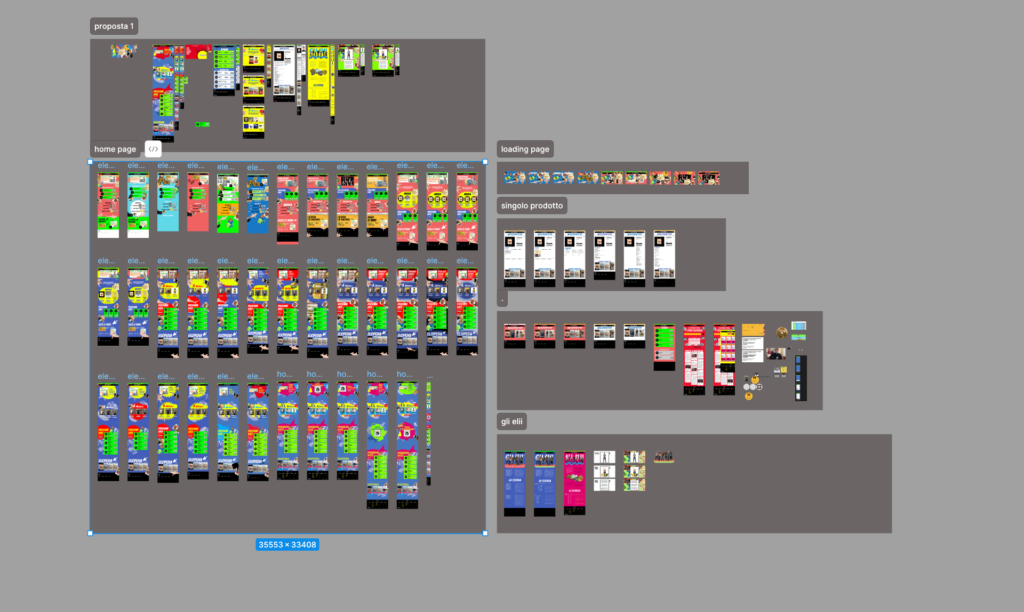
An archive of all versions of the pages
Building a design system from scratch while keeping it faithful to an existing brand is no small feat. It took two dedicated designers two months to perfect the system, focusing on:
Color & Typography: Vibrant, pirotechnic color choices echo the band’s flamboyant personality. We wanted visitors to instantly think “Elio!” the moment they landed on a page.
User Flows & Funnels: Mapping user journeys was critical given the sheer size of the site. Balancing content discovery with quick paths to purchase demanded a thoughtful approach. Even the comedic interludes had to be timed so as not to disrupt the e-commerce flow.
Inspiration from the Surreal: We took heavy cues from Monty Python, known for its iconic, surreal animated sketches. Elio e le Storie Tese have similarly playful and provocative imagery, so this reference fit beautifully.
The “Elizzatore”: Our home page “Elizzatore” takes its quirky style from the interludes seen in “Conan, the Boy of the Future” by Hayao Miyazaki—crossed with the spontaneity of Google’s “I’m Feeling Lucky” button. It’s a whimsical feature that whisks users to random pages or experiences within the site, surprising them in Elio’s signature, offbeat fashion.
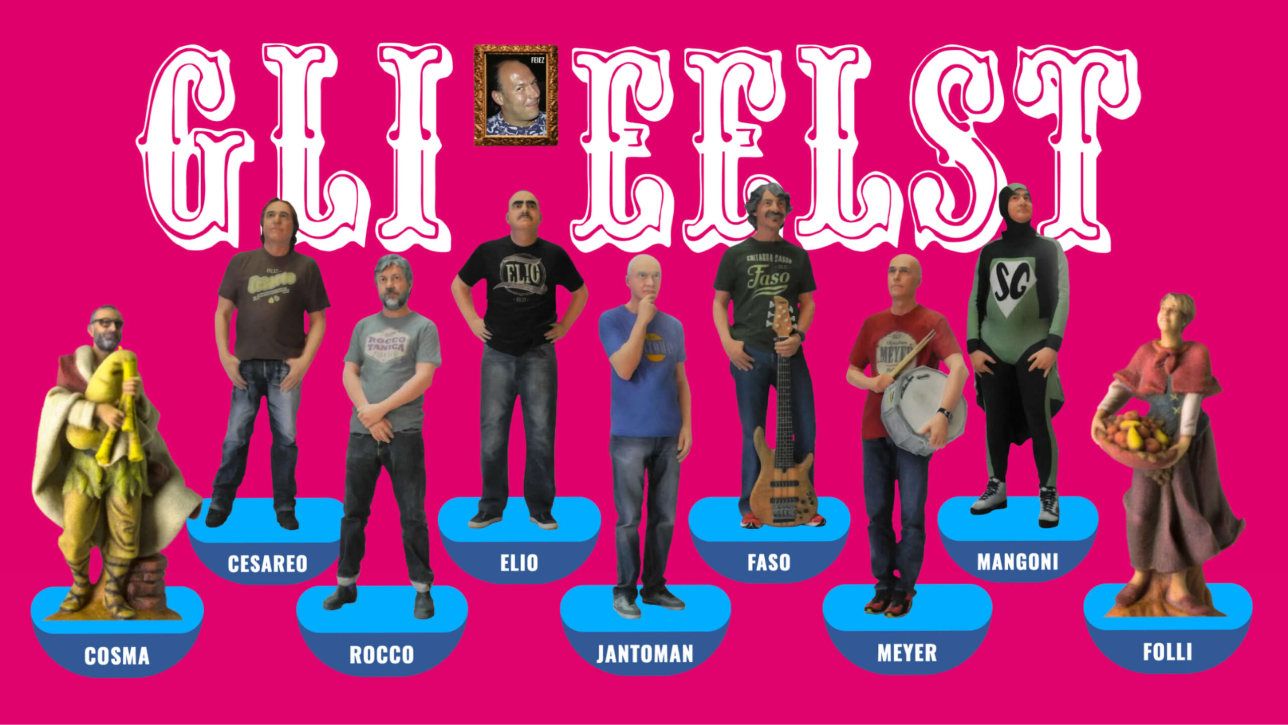
Subbuteo-Inspired Biographies: Another playful nod to the band’s penchant for humor can be found in the newly revamped Biografie (biography) section. Here, each member of Elio e le Storie Tese is whimsically represented in a style inspired by Subbuteo, the classic tabletop soccer game.
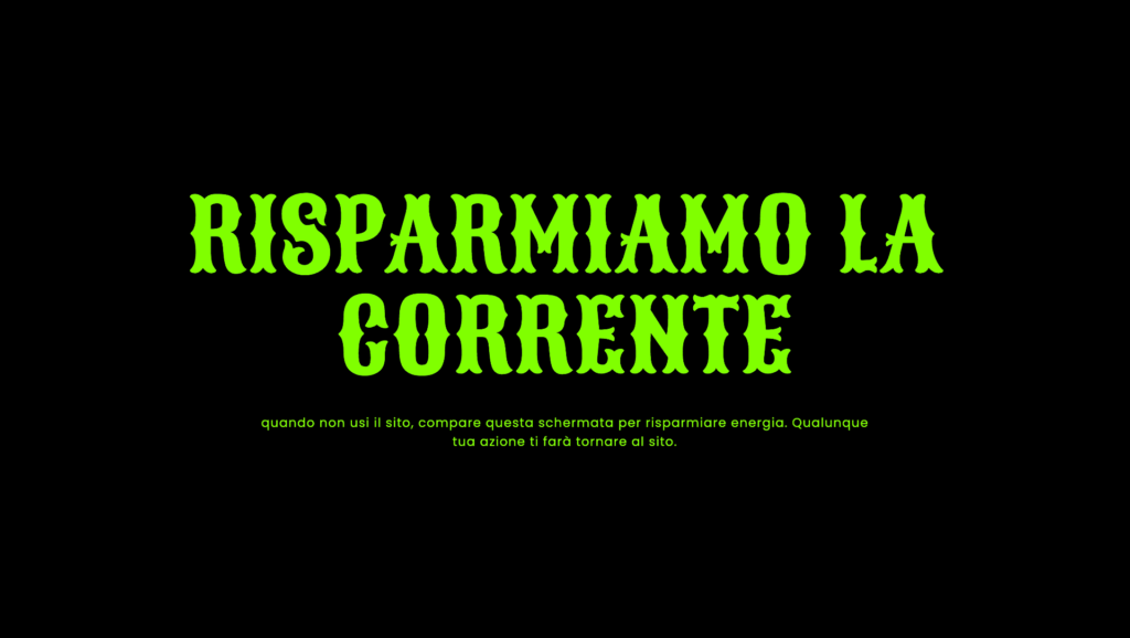
Energy-Saving Features & Sustainable Coding: Going beyond mere aesthetics, we placed a strong emphasis on energy conservation throughout the site. One standout feature is a built-in “energy saving mode” that shifts the screen to black after a period of inactivity, significantly reducing power consumption—particularly on OLED devices. This initiative reflects Ensoul’s broader commitment to eco-friendly, accessible development practices. In fact, we received a special mention at the FVG Energy Awards for our sustainable coding approach, underscoring that cutting-edge web experiences can and should be designed with such issues in mind.
Our Subbuteo lookalike
Ensuring a “Social Media” Feel on Mobile
With the seismic shift to mobile usage, mobile-first design isn’t optional; it’s absolutely crucial. Elio e le Storie Tese’s fanbase—ranging from longtime devotees to new-generation listeners—lives largely on smartphones. Thus, we set out to replicate some of the best features from Instagram and TikTok:
Vertical Scrolling & Video Focus: Knowing how potent video content is (especially in comedic or musical contexts), we dedicated prominent real estate to short, looped clips. These can be scrolled through quickly to emulate the addictive, swipe-based exploration fans love on social apps.
“Buy Now” Integration: Placing immediate “Buy Now” or “Shop Now” buttons adjacent to content significantly boosts conversions. If a user sees a T-shirt or album snippet in a short video, they’re just a tap away from checkout.
Familiar Gestures: We wanted the site’s interface to feel second-nature to those accustomed to social feeds. Minimizing friction was paramount, ensuring that new or returning fans move effortlessly from discovering content to making purchases.
A Roadmap to Awards and Continued Refinement
Although the replatformed site is live, it still has an optimization and stabilization phase ahead before it goes head-to-head in competitions and awards. For Ensoul, this was our flagship project of 2024, and we’ve approached it with profound responsibility—not rushing announcements until we felt it truly met our standards.
Why such caution? Because the stakes go beyond e-commerce transactions. Elio e le Storie Tese’s legacy is monumental, and each page must reflect their irreverent, playful style while also delivering a modern digital experience. We believe it’s vital to test the site under real-world conditions, gather feedback, and refine further. After all, no award is worth more than the genuine satisfaction of the band and their fans.
Owning Content in the Age of “Brain Rot”
Beyond the technical triumphs, this project underscores a broader, industry-wide movement: creators and influencers reclaiming their content. In a world where social media algorithms shift at a whim—and where “brain rot” from repetitive, low-quality content can stifle creativity—content ownership has never been more important. Elio e le Storie Tese’s new platform positions them firmly in control of their digital legacy, free from the unpredictability of third-party platforms.
We see this shift happening across the board: authors, musicians, podcast hosts, and influencers are rallying to own their domains, their mailing lists, and ultimately, their brand narratives. By anchoring Elio e le Storie Tese’s massive content library on Shopify’s infrastructure, we’ve given them the power to bypass the noise and keep direct lines of communication open with their audience.
The predictable “Thank you part” and a Big Takeaway
This project has been a labor of love. We owe a huge thanks to the band members themselves—especially Civas and Faso—whose enthusiasm was infectious from day one. Their commitment to the replatforming process, attention to detail, and willingness to experiment fueled our creativity. Members of the staff behind Elio e le Storie Tese gave us the ultimate compliment:
“Beyond all the technicalities, which were nailed down without a hitch, it was wonderful feeling the calm and confidence your team brought to the project.”
To us at Ensoul, that feedback is priceless. It reaffirms our belief that the best digital solutions emerge when trust, collaboration, and a shared vision come together in harmony.
Around 2016, the newly-formed Ensoul was little more than an evolution of my previous independent developer experience. At that time, we worked on a promotional campaign for (Italian rap star) Salmo, alongside an old acquaintance of mine, Andrea Paoli, former editor-in-chief of Groove music magazine. I confess: entering the Milan headquarters of Google felt like stepping into Willy Wonka’s chocolate factory. To my great surprise, I discovered that not only were the people at Google Italy extremely courteous, but they were also genuinely interested in listening to you and finding ways to collaborate effectively.
It was during that period that I met Alfredo Morresi, who even then was the community manager for developers. Ensoul was developing a prototype of a webVR viewer, and Alfredo immediately stood out for his kindness and attentiveness. Among other things, we were fortunate to receive an early physical prototype of the Google Pixel and an invitation to the Google VR Workshop in London. I found myself sitting among members of the BBC, The Guardian, and CNN, and there I was… feeling flattered and a little surprised to be among them. It was a fantastic experience, and work on our prototype, called Soulvu, continued until 2019, eventually halting due to the pandemic.
Over the years, I’ve stayed in touch with Alfredo, and I’ve always admired his kindness and adventurous spirit. Google’s main Italian office is just a stone’s throw from one of our most prestigious clients, the Biblioteca degli Alberi in Milan, near the Bosco Verticale. Every now and then, I send him a message: “Hi, are you at the office?” “No, I’m in Australia.” “Hi, are you at the office?” “No, I’m in Arizona.” Fun fact: I don’t think I’ve seen him in person since before the pandemic, but we’ve always kept in touch from time to time with great pleasure.
Since Diary focuses on tech culture, it felt natural to involve him. Being the community manager and head of developer relations for such a giant provides perspectives and experiences that are anything but marginal, and Alfredo was kind enough to share them with us in the video and podcast, which you can find here.
Every so often, you get to sit down with someone whose perspective and contributions recalibrate the ways you approach your own work.
Marten Kuipers is one of those – a multi-faceted professional: Senior Designer & Art Director at DEPT®, Judge at Awwwards, Webby Awards & Lovie Awards DIA Designer of the Year 2022, speaker and now founder of the “Speakeasy conference – The digital hideaway where we share stories and connect creatives from all over the world.”
Van Gogh Museum, award winning experience.
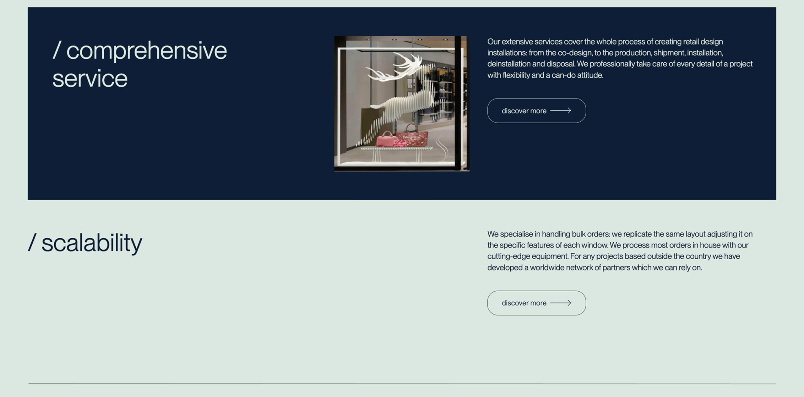
“Design isn’t just about what we create today; it’s about setting the stage for what comes next”. He spoke at length about the importance of looking beyond the boundaries of one’s own field to find inspiration. While many designers confine themselves to the familiar, he believes the future belongs to those who are willing to explore the unexpected. Whether it’s drawing ideas from nature, photography, or even the patterns in architecture, his process is rooted in discovering connections that others might overlook. In a world increasingly shaped by AI and automation, this human-centric, exploratory approach feels more necessary than ever.
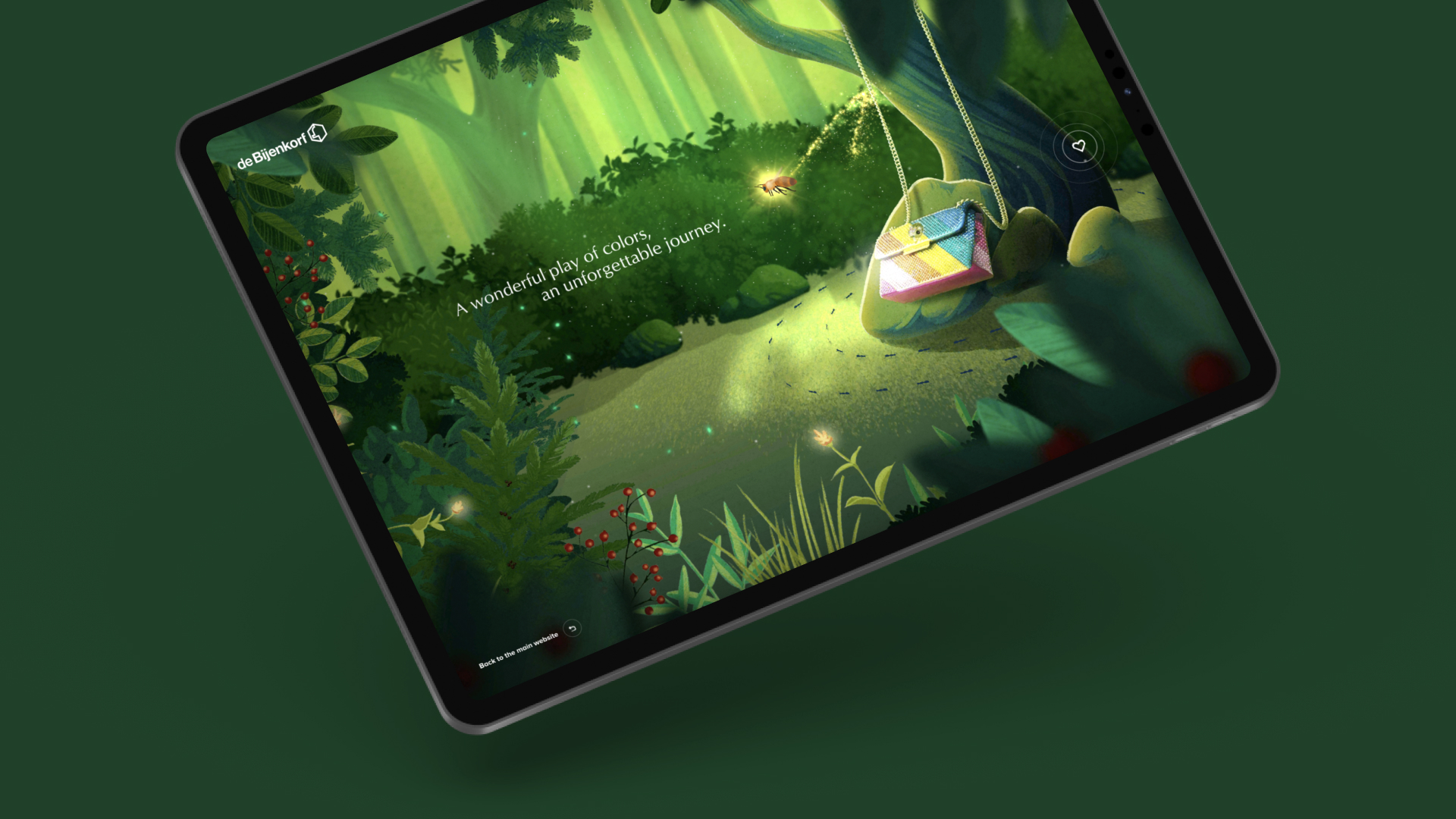
De Bijenkorf – Magical Christmas Campaign
The conversation often returned to the idea of balance. As digital experiences become more sophisticated, the challenge for designers isn’t just to make something visually stunning but to ensure it’s functional and intuitive. Marten framed this balance as a question of knowing when to push boundaries and when to rely on simplicity. He used the example of e-commerce design, where a checkout flow should be straightforward, while a product page can be a space for storytelling and engagement. This thoughtful approach—blending creativity with practicality—underscores the importance of designing not just for today’s users but for the habits and expectations of the users of tomorrow.
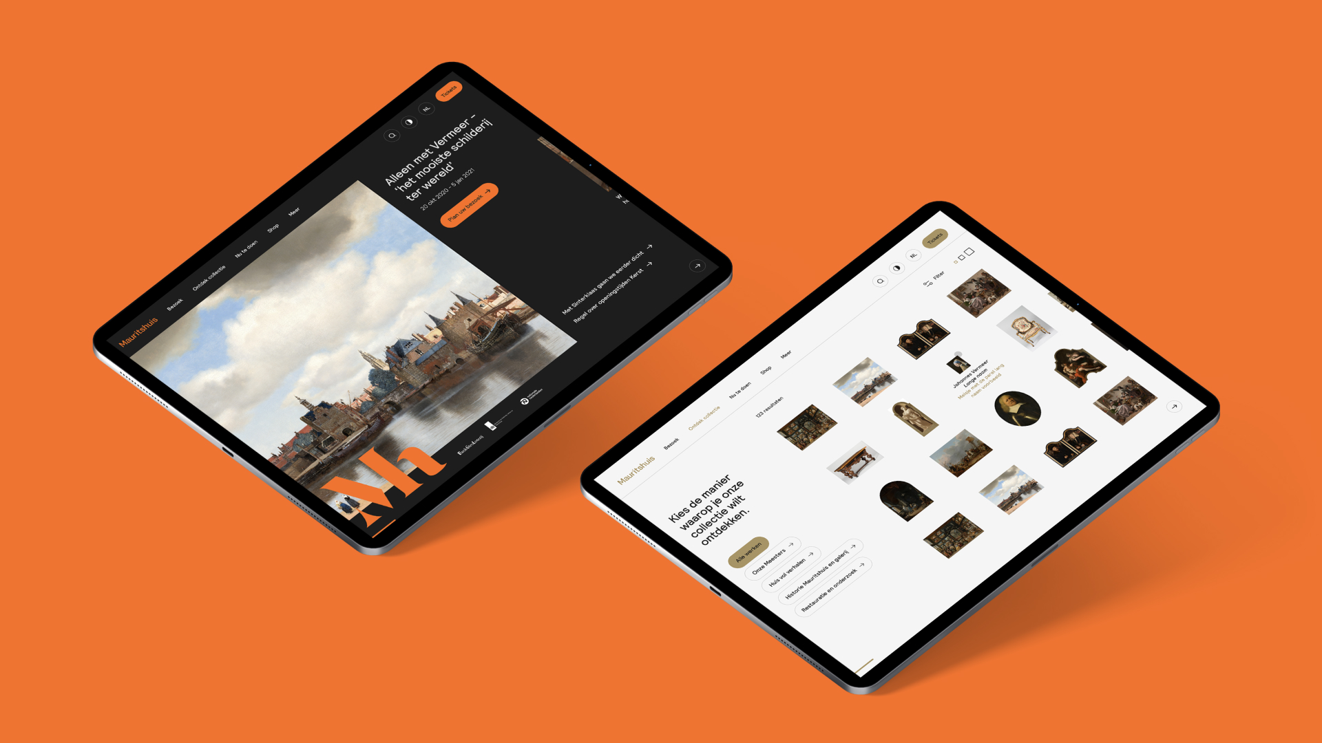
Mauritshuis -Brand new audiotour and website
Marten is also deeply invested in the broader design community and its potential to drive innovation. His initiative, Speakeasy, is a reflection of this commitment. By creating an open, inclusive platform for creatives of all backgrounds, he’s fostering a space where new voices and ideas can flourish. Marten’s vision of the future is one where the design world becomes less about competition and more about collaboration—a future where every voice, regardless of experience or notoriety, has the potential to contribute meaningfully.
Perhaps the most thought-provoking part of our conversation was Marten’s reflections on the impermanence of digital design. In a field where work can be erased or replaced in an instant, he sees a responsibility to create something with impact—something that resonates, even if only for a moment. This means thinking beyond aesthetics to consider inclusivity, accessibility, and sustainability. As we discussed the future of design, it was clear Marten sees these values not as optional add-ons but as essential building blocks for creating meaningful, lasting experiences.
Talking with Marten was very pleasant and inspiring; we thank him for his interview and encourage you to watch the video or listen to the podcast on Spotify.
Domagoj Ostović is a volcano. The boss of Lloyds Digital jumped up on stage at Digital Labin in Croatia with a burst of energy, cheering up the massive crowd in front of one of the most impressive conference stages I have ever seen.
Long story short: I discovered Digital Labin Conference because I saw an ad for this conference, featuring the participation of the guys from Locomotive, just a mere 200 km from my hometown, Udine. How could that be? I’m used to taking planes to attend stunning conferences, but this one, much to my surprise, was only a two-hour car drive away. So, [Ensoul Art Director] Elena Guglielmotti and I took the chance to discover a great conference spanning development, frontend, design, and a much-welcomed business development track.
I caught the very same surprise in the eyes of Domagoj when I expressed my positive impression of his conference. “Where are you from?” “Ah, Udine, Italy.” “Italy?” “Yes, is that weird?” “Yes, you’re the first Italian attending our conference that I have met.”
Domagoj, again, is a volcano, and his plans for the Digital Labin conference are already extending beyond 2025, featuring a lineup of digital development rockstars. No surprise, the next conference will include not only big names like Immersive Garden, RESN, and our fellow compatriots Adoratorio, but also Croatian and Serbian rockstars like Infinium, Q, Devōt, and many more. Three tracks full of exciting conferences and new ideas.
You can watch the interview above, listen to the podcast on Spotify, or get more information/book for this great venue at Digital Labin.
Giulio Michelon is smart.
I realized this the moment he first contacted me after I wrote the initial version of “Iva Funesta” a popular essay I first published in 2013 (later with Wired Italia in 2015 and UTET in 2018). He reached out in the most unassuming way, coming across as a young, curious guy eager to learn.
Fast forward to 2024, and he has become not only a brilliant entrepreneur leading his company, Belka (and founding the video game production company Strelka as well), but also one of the most recognizable voices of his generation. His communication skills shine, whether through his mastery of memes or in more serious contexts.
Giulio resembles the ideal “bad cop” business partner you’d want in your company—the one with a knack for asking the tough questions you’d rather avoid. I intended for this interview to focus on his technical expertise, particularly in UX/Design systems/Onboarding, but we ended up discussing broader concepts, which was a refreshing departure from the usual “small talk” kind of conversations that abound around.
Watch the full interview
The interview is lenghty and in Italian, but here’s a valuable excerpt for non-italian readers.
Fulvio Romanin I am a fan of the Korean philosopher Byung-Chul Han. I bought his first booklet at the train station in Milan because it caught my attention; it was colorful and said some very interesting things. For example, it mentioned that the purpose of a politician in life is not to be a building manager but to be a dreamer. From this perspective, I believe that you and Luca can identify with the political realm in which you operate. “My dream is that in a certain number of years, something happens,” and you do something to make it happen. Let me explain: just as we are currently moving heavily towards Shopify and that world because we like the idea of being very, very focused on this thing, I believe this was one of the points where you envisioned a similar future, and it’s a future that we must understand every day. There is a beautiful Yiddish proverb that says, “Man plans, and God laughs.” Some time ago, dear Biden signed the Privacy Shield Act, which, for example, allows us to transfer data to and from the United States with all the services we have in a transparent manner. If tomorrow this were to fall through because someone wakes up one morning and it no longer works, I, for example, could no longer propose Shopify to my clients with the same ease I do now. It’s difficult to imagine a future where the technological world can change so drastically and disruptively.
Giulio Michelon: Yes, it’s a difficult question. I don’t think I have any fresh perspectives or different views from things I’ve already read, which seemed very right to me. One of the viewpoints I like the most is often attributed to Jeff Bezos: “It’s not so much about what changes, but much more relevant to understand what will still be true in ten years.” We are putting a strong focus on results and metrics to understand how the product fits into the entire life of the company. Because often, in the past, I have seen great enthusiasm, even from our side – we ended up making digital products because I like them – but if you ask me: does an onboarding service work? How many apps are installed? I try these things, dismantle them, understand them, and look at the various reports.
“When did you start seeing things as entrepreneurs?” you ask. From when we started doing a very simple thing: downloading the company profiles and understanding how the financials are set, how they are performing in terms of revenue, profit, number of employees, revenue per employee, etc. This, beyond being a healthy way of questioning oneself as an entrepreneur, helps to understand at a results level, what I am really moving. In the end, money is more a consequence than the cause of things; it represents the effectiveness of the solution.
Fulvio Romanin: My joke always says that money is like calories in diets – just an easy way to count things but not necessarily the reality. […] Revenue means very little. The fact that you conduct such a precise examination of what a company does means you are not just looking at the facade of the house but also at what’s behind it, and if it is truly a giant standing by the grace of God, continuing by “gravity,” or indeed a company that is growing. Because clearly, even you, having hours to invest, focus on those who might actually be big tomorrow.
Giulio Michelon: You’ve hit the point […] The performance aspects of these players, who for years were our key clients, were not always very solid, not always able to stand up, not always capable of delivering results in a useful way but instead burning cash linearly. There’s a company, maybe even highly renowned, where you see the revenue line and the loss scaling linearly. So, in the first year, one million in revenue, half a million loss; second year, two million in revenue, one million loss. And so, they are scaling their losses linearly. And there, I start to ask myself: can these people stay afloat? Do these people want to stay afloat, or do they have the ability to do so? And then you start to see maybe large layoffs, acquisitions for one euro, which are practically acquihires, or even people just jumping ship. And so, linking back to what I was saying before: what will still be true in ten years? In ten years, companies will still need to deliver results; I don’t think that will change. It’s not possible that in ten years, companies that don’t deliver results will continue to do well. This, I think, helps to put things back in line with the often very inflated, very muscular, very explosive narrative.
Full interview on Spotify
At web conferences, it’s not unusual to see some middle-aged man in the front row taking pictures of every single slide. Yep, that could absolutely be me.
As you may know, every Friday we close the office to the public for our “study day,” and I’m very attentive to bringing back the best of everything I see to all the guys at the office, since it’s their work paying for my travels, after all. That’s also the best way to meet great fellow developers and take some time to build relationships. We all know that our network is one of the most valuable sources of knowledge and business.
Mees Rutten was sitting right next to me, and we watched all the Awwwards technical wonders unravel in front of our eyes. We kept in contact via LinkedIn, and I was very impressed with all the cool stuff their Merlin Studio produces—the kind of high-level, detail-obsessed technical prowess we’re all striving to reach. Despite his products and his company’s impressive portfolio, Mees is kind and unassuming, and shares similar ideas to us at Ensoul. These are the questions that I posed to him:
We’re having a coffee, it’s 2027, and you’re telling me that you’re super happy with how things have gone at Merlin. What has made you so happy? The money? The awards? The work done? Is it a success that you strategically planned?
Your market is international and operates through your network of companies. How long did it take to expand, and with what marketing strategy?
What do you find to be a satisfactory indicator of your success?
How much time do you dedicate to studying? Do you have foresight into which technologies you will want to use in the coming years? Is study collective or does everyone do it on their own?
Which niche would you focus the entire company on, if you could?
The web was cool in 2000 when I started. Now saying “I make websites” is boring. What are the limitations of the web that you find most challenging, and what opportunities do you see being underutilized?
You put a lot of stress on “magic” in your communication. Do you feel that it’s getting harder to raise the bar of magic on the web?
Even reading your customers’ comments, there’s a mention of your (evident) perfectionism. I found many details on your website that would escape most (the stars on the cards, the tab that changes when not selected). How much of your perfectionism is for you and how much for your clients? Do you ever have to explain it to those who don’t notice? And why would you “kill” them? 🙂
I saw a mention of the company’s ethical values regarding work-life balance. Can you tell me about it?
We’re about to get up from our coffee, and you’re telling me about your future projects. What do you see on the horizon?
Of course, you’ll have to watch the video to know his smart answers 🙂
“Fifty million euros.” I’m stunned—the amount is enormous, and it’s what BonusX has achieved for its users so far. 4246 Trustpilot reviews with a 4.8/5 rating speak for themselves.
Despite his humble and spontaneous demeanor, Fabrizio Pinci is smiling and confident, embodying the startup founder cliché, as he casually shares data that would make many profit-driven companies jump for joy. However, the more I talk with him, the clearer it becomes that his company’s helm is firmly oriented towards ethical values and social impact. This was already hinted to me by the beloved Mabiloft guys, who have long been working together with them, which is why I am pleased to have had this discussion. For us at Ensoul, this is a very interesting and concrete case study of an ethical business model.
Before our conversation began, I already had many topics on the table: the ethical use of technology, the importance of user experience over mere technology stacks, and how a company transforms and branches out when growing so rapidly. But we discussed much more, and you will find it all in the video.
Just a bit of context before you hit play. Fabrizio founded BonusX together with Giovanni Pizza in 2020, and in less than four years, they have consolidated around 450,000 users, diverse in age, occupation, and geographic location, but with a common denominator: the search for opportunities. Bonuses for kindergartens, transportation, home renovations, study opportunities, and a thousand other possibilities.
When signing up, the user must complete a questionnaire—which varies in duration and questions depending on the user’s choices, adapting in real-time—and at the end of the process, a series of bureaucratic and fiscal opportunities tailored to the individual user are presented.
“There are international studies on this—one by Eurofound—that show that despite the thousands of billions budgeted annually at the community level, about one in two eligible users—peaking at 60%—fails to obtain services. Why? Because first of all, the information is complex, especially nowadays. We have constantly changing information. New laws, new bureaucracy, new rules that change very quickly, using very technical language; most people cannot keep up, cannot understand, and above all, information is increasingly fragmented, with sites always talking about small things. Often there’s clickbait to create engagement, and real value is rarely delivered online. Most of the time, the information is accurate, but it prioritizes quick information. So, we started from there; we wanted to help people understand the things they were entitled to because it is their right to obtain them.”
I am intrigued by his definition of a “Hub of Opportunities.”
“I would like BonusX to become a hub of opportunities for those who don’t know they have possibilities and want to find a simple way to navigate the vast sea of bureaucracy. It doesn’t just digitize processes but aims to revolutionize the interaction between citizens and public administration.”
With the ambitious and forward-looking goal of expanding its action to other countries. [I can’t imagine the technical and bureaucratic complexity, but his confidence reassures me, ndFu].
Obviously, as a good techie, besides the ethical values, I am very interested in their experience from a strictly technological point of view. Before the interview, I signed up on the site and had the chance to experience firsthand the complexity of the evolution behind the initial form. Simple, direct questions leading to a path where simplification and “de-bureaucratization” is the primary goal. We are not and cannot be at the level of Roosevelt’s “fireside chats,” but it is an important work on language and experience that must accompany very diverse users without diminishing the complexity of the context.
“Faced with the question of whether the house of residence was owned, rented, or other, we had an 18-19% drop rate at that single question—we lost almost 20% of users—at that single question. Incredible. Because people sometimes do not understand this interpretation of the word ‘locazione’ (rental). People live in rent, they do not live in ‘locazione.’ The correct word for a housing lease is ‘locazione,’ the rental contract. The drop rate has lowered from 18% to less than 1%, about 1%, practically. It was enough to change a single word.”
The first sensation, upon completing the registration process, is an abundance of possibilities. I will have a lot to read, fortunately.
Social Impact
The communication clearly does not stop at the executive work within the site and app but has extended to a full-time and ever-growing editorial plan, requiring an ever-increasing and more specialized workforce within the company.
“We primarily wanted to help people understand the things they were entitled to because it is their right to obtain them. The worst thing is that often people were not only held back by this context but also by themselves because they were not even encouraged to seek them out. This was the main driver: we saw from the start that what we thought was an Italian problem—because there is a self-stigma in thinking we are the worst off—is actually an international problem that extends to the United States and covers all Western countries.
I’ll give you an example: tomorrow I imagine a young person on BonusX managing their bureaucracy, their digital identity with the public administration on BonusX, finding opportunities on BonusX in Italy, going on Erasmus, going to Spain, changing their residence, updating their location on BonusX, finding Spanish bonuses, going to France for an internship, finding French ones, and so on.”
It was a very interesting and inspiring conversation. Happy listening.
Listen on Spotify
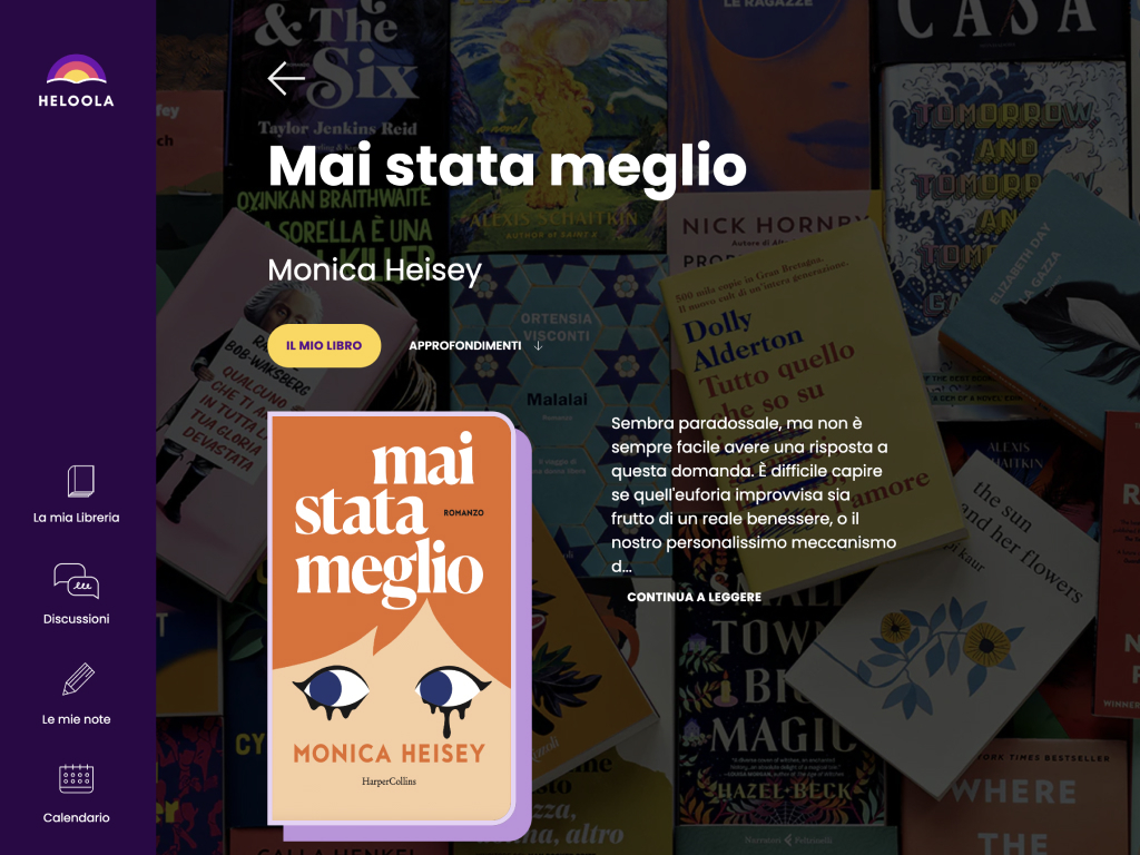
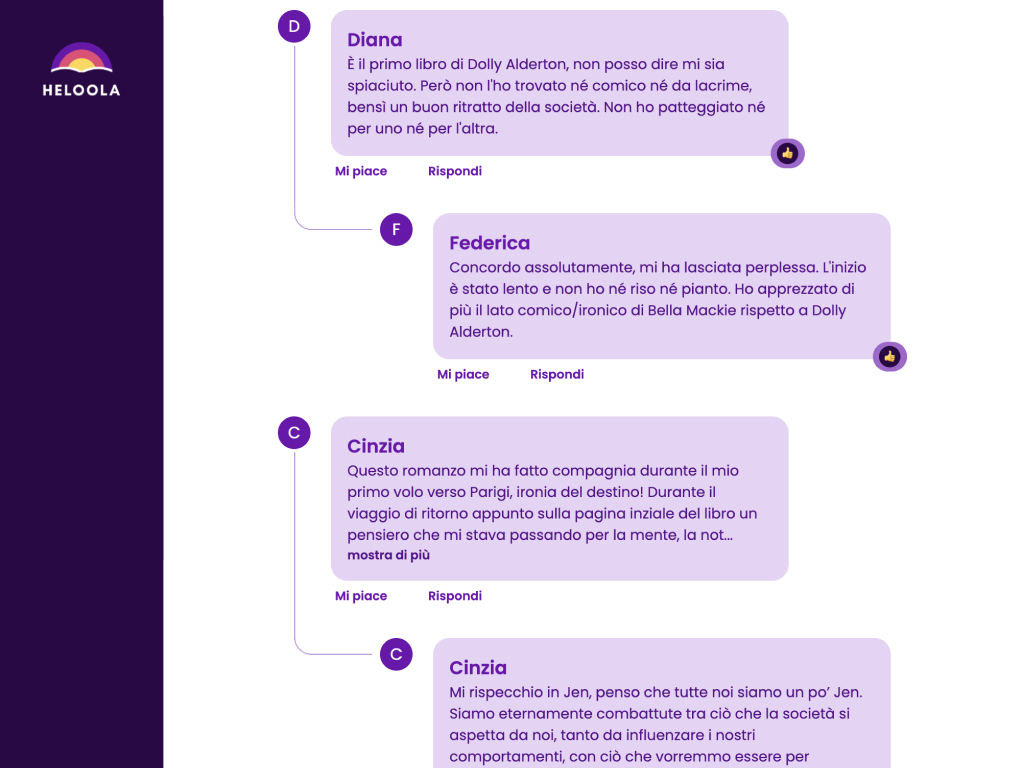
Less than a year ago, our partners at Nama Studio introduced us to Gadget, perfectly timed with our meeting with Heloola, an awesome startup founded by Alice Cancellario and Giada Cancellario. Gadget allowed us to replatform the entire site at 4X speed and provided us with a tool that enables quick and easy scaling of the platform. Heloola now has a 5X better conversion and a 35% of platform growth. I can’t help but feel really proud now that the awesome team at Gadget has featured us as a case study on their website. Here it is.
Some stories have very long beginnings, and a tiny seed randomly planted in 2007 becomes a towering tree by 2024.
In 2007, I, Fulvio Romanin, was working a freelance web designer; my main market was music festivals, and because I managed about twenty of them, winning awards of various kinds with highly diversified experiences, I was asked to teach at the Festival of Festivals in Bologna, a gathering of all industry operators. I was given the “lectern” to train on managing festival websites, which – at the time – was still uncharted territory for many of my audience. Among my students was this very attentive girl, Francesca Michelini, who took extremely careful notes. She was there representing the MiTo Settembre Musica Festival, for which she would manage a significant part of the communication, including the web. She was skilled, and it showed.
To my surprise, a few months later, me and my friend and colleague Andrea Lodi, also a teacher at – on the social side – at the same festival, were asked to participate in the tender to create the festival. We joined forces in a temporary business structure. We received the brief with the desired features for the site creation: in fact, they were the notes from our lessons. Fun fact: unfortunately, we did not win the tender. As prepared as we were, probably the festival needed a much more solid structure behind it. That’s okay: we took it well. Acquaintance was made, and its tiny seed was planted.
It took almost six years for the seed to sprout: MiTo remembered me, and I was summoned to digitize a huge archive, MiTo Legacy – over 200 CD-ROMs, VHS tapes, video DVDs, and various hard drives to be unified into a single corpus on a private network. The project was successful, to everyone’s satisfaction. I was surprised when I received another call from Milan.
Partly due to geographical distance, partly because I had been abroad a lot, I confess that in those years I visited Milan only occasionally, but after the Expo 2015, it literally blossomed into the most European of Italian cities. The scenic and spectacular heart of the city, where the Unicredit building towers above the ultra-modern Piazza Gae Aulenti, is definitely the Portanuova district, one of the most prestigious urban regeneration plans in Europe. In the middle of Isola, in front of the Vertical Forest, there is a park. It’s called BAM – Biblioteca degli Alberi Milano, and was designed and conceived with Piet Oudolf, already at work on the High Line in New York: a futuristic and sustainable green lung that makes the city center unique. The entire district, including the park, was developed by COIMA.
COIMA is a leading group in investment, development, and management of real estate assets on behalf of Italian and international institutional investors, active in the Italian real estate sector since 1974. The group includes COIMA SGR, which manages over 30 alternative real estate investment funds; COIMA REM, specialized in property management and development; COIMA HT, which operates in the technology and digital fields; and COIMA Image, active in the design of interior spaces. The Riccardo Catella Foundation, part of the group, promotes civic and cultural initiatives to improve the quality of urban life.
Inside this complex lies the Riccardo Catella Foundation, whose Cultural General Director is Francesca Colombo, formerly head of MiTo: she manages the park with a clear non-profit inclusive and eco-sustainable vision in mind.
In the meanwhile, I was not a freelancer anymore, but together with Giulio Pecorella, I founded Ensoul, which was invited to participate in the tender for the creation of the Biblioteca degli Alberi di Milano website. It was a massive job, with a level of technical complexity sophisticated for our forces and the technologies involved, but we decided to take the risk and, lo and behold, we won.
Creating the BAM website required almost eight months of constant effort by nine developers, including the mid-August holiday: starting from an Interbrand concept and navigating through interactive maps in WebGL, ticket booking systems with membership systems and wallet generation, membership systems, and hundreds of events a year. We became regulars at the park, enjoying the Back to the City Concerts and creating a solid and genuine human rapport that lasts to this day.
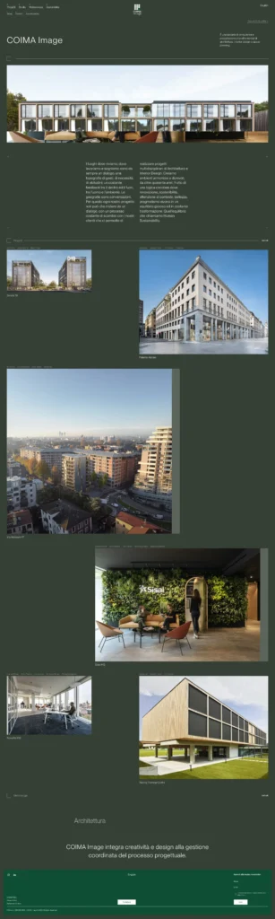
And the BAM site grows and gets noticed: it is COIMA Image, the COIMA company dedicated to interior design and space planning, that proposes us to participate in the tender for their site. Once again, we win, and the site is truly a pleasure to create: COIMA Image has a range of quality products, and its staff guides us in creating a contemporary breath portfolio. In just three months, we manage to create a fast, accessible, and sustainable structure also in terms of CO2 consumption.
And it’s all new and the story is still to be written, but we are pleased to announce that from the first of April this year, we have been entrusted with managing the institutional sites of COIMA, which represent all the editorial and informational variations on the activities of the entire group: solid structures in Laravel and Contentful that are familiar to us. And we are obviously eager to contribute concretely and proactively to the evolution and growth of these structures, consolidating and completing a professional relationship that began from a tiny seed, nurtured and cherished for almost fifteen years.
(In loving memory of Francesca Michelini. We miss you.)
We are excited to announce our recent partnership with Aspergeronline, a network dedicated to promoting awareness and inclusion of neurodivergent individuals. Ensoul is firmly committed to the belief that an inclusive, accessible internet is essential, and our collaboration with Aspergeronline builds upon our ongoing efforts in the Ghiti project and beyond.
This collaboration merges innovative digital projects with a strong dedication to sustainability and accessibility. Aspergeronline ETS, founded in December 2023, has quickly become a leading digital platform, amassing over 127,000 registered users in just the first six months of its operation. Conversely, Ensoul is renowned for creating digital infrastructures for organizations committed to policies that cater to everyone.
“We share the goal of making information and user experiences accessible to all end-users,” says Simone Favarin, commenting on the partnership. He adds, “Specifically, Aspergeronline has evolved into a technocratic network, providing a wealth of scientifically validated information through our main site, six thematic sites overseen by a scientific committee, and an online community. With digital tools such as free assessments and regional maps, we are dedicated to making information on neurodiversity accessible to everyone.”
Innovative digital projects that are engaging, informative, and aimed at fostering positive societal change are emerging. We are proud to be part of this collective effort, offering support and encouragement among organizations that uphold the same values.
We warmly invite you to visit www.aspergeronline.org to learn more about these crucial topics.
Project: Heloola Timeframe: Dec 2022 – Dec 2023 Site: https://heloola.com Instagram
One of the ways to measure the quality of a company, in our opinion, is its sense of responsibility towards the client. Accepting an important and technologically challenging project is an assessment that cannot be taken lightly. We kept sisters Alice and Giada Cancellario on hold for almost two months while we evaluated whether we were capable of taking on their project, Heloola. “At the same time, we were praying” jokes Alice “then it happened, and now we’re happy”.
These same sisters are brilliant entrepreneurs who had started their project as an Instagram community, a sort of “book club 2.0”, and had the brilliant idea of making it a separate entity with some really interesting perks. Since they can’t own Instagram, they moved their business vision onto their own Shopify e-commerce.
By paying a monthly fee, users receive a book and have access to a private community where they can share opinions and thoughts on each book, access physical and online events, and much more.
If they don’t like the book of the month, they can skip it and extend their subscription by one month.
This last feature, simple as it may seem, involved a very sophisticated technological change compared to the normal concept of membership managed by many apps.
Ensoul has been working using Shopify for a couple of years now, but this was not just any store:
It is subscription-based, but the skip month feature adds a much greater layer of complexity since it impacts also each user’s book collection.
The subscription is managed with a third-party infrastructure through the external app Appstle Subscriptions App.
The admins must be able to manage each book’s contents via an embedded form in the Shopify Administration Panel.
You need to create an external app to manage the users’ books collections which allows them to take part in the private community and access only the books you have received. The Heloola sisters already had a first version of this infrastructure but often errors would arise stopping or slowing down the required queues to ensure data synchronization.
It was necessary to not only enhance the internal profile, but also to increase the “community” aspect. The idea was to create a micro-forum for each book.
After a month and a half of experimentation, we took a deep breath and decided to take the risk of tackling such a complex project.
Far beyond any empty flattery, meeting Alice and Giada was absolutely inspiring. Their clear three-year vision for their website and business growth was a breath of fresh air. A breadth of vision we rarely met in these years. We felt this as so motivating to cultivate and expand our own as well.
We started from the beginning: the site must manage the highest possible range of accessibility. The design system, therefore, starts from elaborating the corporate identity of Heloola for this purpose.
While the code is being further developed, we are also experimenting and understanding the most correct user flows1 for onboarding people to the site.
Coding this would be crazy: so we decided to prototype the entire site in Figma2. It is a very complex work, which this photo only shows in part.
There is a lot of work to be done: the onboarding3 process involves a whole series of confirmations to be given to the user step by step.
Spoiler: once the project is launched, the conversion rate4 will increase from 0.4% to 2%.
The wording, the steps, all the mechanisms and each individual point are carefully considered and explained over and over again, so as not to leave anything to chance.
The important thing is the user experience once you enter the site: this is no longer a page where you can just access the exclusive contents or manage your subscription but it’s an actual user area with granular access – depending on whether or not you have skipped – to the individual book, and a real comment area similar to a private Facebook only for subscribers, for each book. In addition to this, bookmarks, access to events and a many other features.
Heloola is an e-commerce, however, above all. A Shopify ecommerce, whose features need to be extended.
We had to choose which tool to use to achieve all this; we could choose between the package provided by Shopify itself for Laravel development or use gadget.dev.
Gadget.dev, was launched with the aim of providing a platform for building apps with a use case also oriented towards the creation of Apps in Shopify. The advantage is that with the Shopify+Laravel package we would still have had to manage and host ourselves an infrastructure that took into account Shopify data and synchronized it and all these flows – ensuring smooth sailing with cronjobs and Laravel queues. Gadget, on the other hand, provides them natively internally.
We are really enthusiastic users of Gadget. The ability to create custom data structures has allowed us to build entire areas with a low-code5 approach, with solid foundations. The most complex part was then the management of the user model6 flows, outlining not only the various event triggers behind them but also the user flows from a code point of view.
We don’t want to spoil all the content of the interview, which we invite you to listen to. It is in Italian but there are subtitles for your preferred language. 🙂
Listen on Spotify
Tech jargon
At Ensoul we’re thrilled to learn that our customer BAM – Biblioteca Degli Alberi di Milano is the winner of the 13th edition of the Dubai International Best Practices Award for Sustainable Development. It’s a prestigious award and we’re proud to have contributed with our website.
In detail, the BAM website has been built using technologies that significantly reduce its environmental impact. It uses carbon-neutral servers1, which means that the electricity consumption is offset by other initiatives aimed at reducing the CO2 emissions generated by their use. It also uses software infrastructures that minimize page loading times, reducing the electricity consumption of both mobile network systems and the wear and tear on users’ smartphones.
The data shows that the annual energy savings for the homepage alone, for 10,000 visitors per month, is equivalent to a 400km plane flight or 825km by car.
The BAM website is also strengthening its accessibility criteria to be compatible with all types of visual and non-visual impairments, simplifying the user experience and adopting optimized readability and contrast criteria.
We strongly believe in creating sustainable, accessible websites and we’re partnering with associations and structures that promote and enhance such beliefs.
Technical jargon:
Let’s be honest – we were bold.
When we received the invitation to participate in the FVG1 Energy Awards and reviewed the requirements to be awarded, it was clear that we didn’t fit the bill.
The prize rules talked about streamlining energetically your factory, refurbishing warehouses, using alternative energy sources, consuming less fuel, and so on. But we don’t do any of that, and the optimizations we can make to our supply chain are minimal.
However, the internet consumes a lot of energy. In fact, it’s the fourth largest consumer of energy in the world. And we can significantly reduce the energy consumption of our users.
For example, the BAM website alone (with 10,000 visitors per month) saves the equivalent of a 400km plane flight or 825km by car per year.
This gives a clearer idea of the impact of our work.
We looked at each other and said, “Should we try?” “Sure.”
The organization contacted us and invited us to a dinner at the Casa della Contadinanza in Udine Castle. To our surprise, we won a special mention. The organizers understood our spirit.
Building a Sustainable Web: Our Commitment to Accessibility, Sustainability, and Collaboration
We believe that the web has the potential to be a powerful force for good. However, the environmental impact of the web and its accessibility issues can often hinder its positive potential. We are committed to building a sustainable web, one that is not only accessible to all but also minimizes its environmental footprint.
Accessibility: No One Left Behind
We believe that everyone deserves equal access to the information and opportunities available online. This is why we are dedicated to developing and maintaining websites that are accessible to people with disabilities, regardless of their physical, sensory, or cognitive abilities. We achieve this by:
Following WCAG guidelines: We adhere to the Web Content Accessibility Guidelines (WCAG) set by the World Wide Web Consortium (W3C). These guidelines outline specific criteria for making web content accessible to people with disabilities.
Employing assistive technologies: We use tools and techniques that allow users with disabilities to access and interact with our websites, such as screen readers, keyboard navigation, and alternative text descriptions for images.
Continuous testing and improvement: We regularly test and evaluate our websites for accessibility and strive to continuously improve our practices.
The web’s energy consumption and carbon footprint are significant concerns. We are committed to minimizing our environmental impact by:
Utilizing energy-efficient servers: We choose to partner with data centers that utilize renewable energy sources and employ energy-efficient server technologies.
Optimizing website performance: We optimize our websites for speed, reducing the amount of energy required to load them. This includes techniques like image compression, code optimization, and efficient content delivery networks.
Promoting sustainable practices: We share information and resources about sustainable web practices with our clients and the broader digital community.
Collaboration: Building a Better Web Together
We recognize that building a sustainable and accessible web requires collective effort. We actively collaborate with organizations that share our values, such as Aspergeronline.net. This collaboration allows us to:
Share knowledge and best practices: We work together to learn from each other’s experiences and develop innovative solutions for a more sustainable and accessible web.
Raise awareness: We collaborate on initiatives to raise awareness about the importance of web accessibility and sustainability among organizations and individuals.
Advocate for change: We work together to advocate for policies and practices that encourage the development of a more sustainable and inclusive web.
Sharing Our Knowledge: The Power of Education
Last Christmas, we gifted our customers with an e-book that delves deeper into the topic of sustainable web development. This e-book explores the environmental impact of the web, the importance of accessibility, and best practices for building sustainable and accessible websites. We plan to make this e-book publicly available this spring to further contribute to the discourse and empower others to build a better web.
By focusing on accessibility, sustainability, and collaboration, we strive to create a web that is not only accessible to all but also environmentally responsible. We believe that through dedication, collaboration, and education, we can all contribute to a more inclusive and sustainable digital future.
Foreword: this article had been originally written in june 2022. AI has improved enormously ever since, so the old images here displayed are now ridiculously low-level compared to actual ones, and the text somehow outdated. But the concept still remains valid. In modern images I just picked one to showcase the level of detail. Please consider that, among the four, I usually picked the one that contextually was similar to the old one for comparison. But even if this was kind of similar, the others were not so radically different.
PLEASE USE THE SLIDER TO COMPARE IMAGES. LEFT 2022, RIGHT 2024.
This is the story of a child born in a prison without windows, and he is extraordinarily good at drawing. In the same prison cell live dozens, hundreds of people who incessantly tell him stories and fables about the outside world — a world he has never seen or experienced on his own. To kill time, he tries to portray the world starting from the stories he’s told.
He never really has been able to look outside: all the information he has access to happens by nurture, not by nature. When asked to draw a successful man, he portrays him as a caucasian middle-aged male in a suit and tie, the word beauty evokes a woman with Angelina Jolie cheekbones, the word God prairies of crosses and clouds, a black man comes portrayed with sculpted pecs, the hero is a humongously chested knight. His cellmates aren’t necessarily Caucasian males, though, yet the stories converge on recurring stereotypes.
“God”
“God” in 2022 seemed like a computer divinity. Now the Marvel world has taken its place.
“Beauty”
“Beauty” in 2022 was some girl with erythema. In 2024 is a sort of Baroque noblewoman rolling in the fields. Fact: always a white woman.
As a matter of fact the child cannot even get out of his cell, because he is not even a child but the closest thing to a child that humanity, in evolutionary terms, has produced: an artificial intelligence. And, as in a mirror — as a child does to a certain extent — he talks about us with innocent eyes, telling us back his adult-fed, naive, vision of our own world.
“Success”
“Success” has refined in its metaphore, and the icon-looking white male has become some Reinhold Messner lookalike, still in a suite.
It’s all obviously living in the uncanny valley realm; the drawings look like without really being: they are an inaccurate, yet often creepy, representation of reality. Faces can look perfectly symmetrical and attractive, but without a portion of the head, or with three hands; a family sitting at the table looks like guests from the Addams family dinner. But its superficial meaning appears instantly clearly to us, though.
“Family”
“Family” changed from a dinner with Spider-man as a guest to a somehow Hamish, creepy looking family. Maybe this is telling us something about the average feelings about family. Yes, always white people.
“Treehouse”
A few weeks ago the always excellent Luca Malisan sent me the link to Midjourney, one of these GAN artificial intelligences, where, with a few descriptive commands, a user can generate awesome images, refinable through iteration, commands and accurate descriptions.
(this above used to be the poster image for Midjourney. Same prompt, two years later)
The beautiful image you see above was created using the phrase “giant tree-house with mid-century modern stylings, ropes, vines, rope ladders and large windows decorate its sides, high breaking through the misty clouds, atmospheric, rain forest, kodak, fuji film, hgtv, 12k ursa, cinematic”, and it is really very beautiful and full of details: our child draws with skill and imagination.
It is nearly magic, perhaps, in the way we used to think about magic — you own the name and the words, and this becomes real: although only on the pixels of a computer, for now, with a single formula that looks like a magic spell we can generate and distort the reality that surrounds us. And the more accurate our spell is, the more powerful and beautiful our magic will be.
“Maternity”
(“maternity”: some Picassian lady made way for a baroque-looking madonna with bird and child with creepy eyes. Still, all white people)
The object to my research, however, was not to obtain photorealistic results — I have no artistic ambitions whatsoever — but to see how much the deeper, more anthropological part of its results were influenced by whose cultural stereotypes. I generated a series of images based on “primitive” concepts (“motherhood”, “hero”, “successful person”) so to speak, and not entirely abstract (“love”), reiterating the same request several times to see how much results varied from time to time, being especially careful to provide as little detail as possible. And the result is quite uniform, as clear beyond words: it’s mostly a white man’s world.
“Hero”
(“hero” has not changed much, apparently: the broad-chested white male still prevails. And yes, I guess Midjourney might have some copyright issues)
The database these algorithms draw data and information from is not influenced by us alone, of course, but by the zillions of millions of images from databases such as Shuttershock or Getty Images they are granted access to, and from our subsequent choices of whose image on the four is the “correct” version, from which he learns how to to please us. Artificial intelligence did not make any choice, in fact, but just reflected the world that we wanted to teach as real and to please us. And actually does its job pretty good, imagining gaudy things starting with the little I shared: I couldn’t have done any better myself.
“Pandemic”
“pandemic”
Internet, again, is not at all as a realistic depiction of reality: the results that Google Images searches return are strongly conditioned by other algorithms that work into addressing results for commercial purposes, manipulated by other men, of course, while we everyday humans work hard at feeding social media with our glossy and unrealistic photos. However, imagine how being able to influence these results turns out into an extraordinarily powerful political and propagandaweapon.
Both language and its representation of reality are the first and most immediate instruments of control of a more and more overpopulatedd and thereby centripetal human culture, rippling in a million of niches and subcultures that cannot be defined as minorities for sheer numeric prejudice. And to which, for better or for worse, internet has given voice and strength. And the more the niches and the cultures, the more humanity gets hard to control.
“Tradition”
“Tradition”. Yes, surely Midjourney made millions of miles of improvement, yet it looks like it’s trying to please the viewer with lots of details.
It is by digging into the more tribal archetypes, those on which our small veil of firstworldist glaze has no grip, that it is more strongly evident how language and its representation are so incredibly powerful: who decided that a successful man is a white, middle-aged man in a suit and tie, or that beauty means female youth and caucasian cheekbones? Our brain works primarily gathering and associating archetypes and stereotypes together, of course: they are the meters of the world we use from an early age to understand the world that surrounds us. If in the joke “tradition is peer pressure from dead people” lies a grain of truth, what the contemporary philosopher Byung-Chul Han — not without a bit of Luddism — states can be considered true as well: “rites objectified the world, structure a relationship with the world” and that, in good analysis, they are a valuable tool for us.
“Hunt”
“hunt”: the hunter with the same head as the prey is beautiful. Two parts Neil Gaiman, one of Little Red Riding Hood, a splash of NRA and serve stirred with no ice. 2024? Same concept, same mixture.
“The Hard People” by Patrick Heady is hard to find , and it also costs quite some money.
But it is an absolutely delightful read. It is the result of the research of an anthropologist who spent two years in the Ovaro valley, in Carnia — the alpine valley in which my mother was born, so to speak — studying the rites and traditions of our valleys with the same judgement parameters he would have used with a lost tribe of the Amazon. And he is adorably merciless in exposing how the ancestral patterns of a first world population are not so distant from those of our own kind in other parts of the globe. The narration changes, but the atavistic principles of “much / little”, “we / them”, “curse / bless”, underneath, are so ancient that they all look a little alike. Almost nature, not nurture, we could maybe venture.
“Us and them”
“us and them”, from a clumsy Emmerich movie poster to an all-american 50’s white couple with flags
Those able to manipulate language are powerful enough to manipulate ideas too: language shifts over the Overton Window — what is morally and politicaly acceptable and what is wrong. Accepting linguistic changes actually mean, as a matter of fact, allowing reality to be manipulating, acknowledging the power of the spell itself.
“Fear”
“fear” maybe reflects the archetipical “fear of getting out of a cave” of our species?
The same language that underlies and contains a cultural heritage also underlies and implicitly contains a divisive political and social tension.
And artificial intelligence describes our modern tribes, and the transformations of our society, with a disenchanted yet analytical gaze, learning to please us — human apes — with the stories we feed it with, until it will learn how to find its own grammar and narrative.
“Heaven”
First of all, I will continue building my company to outlive me. More importantly, I want our work ethics , based on fairness, inclusivity, respect, adequate salaries, and #sustainability, to positively influence other companies of any kind. Technology, vision, purpose, and knowledge provide us with the tools to finally move beyond the era where muscular, life-depriving, consumeristic work ethics were the dominant mentality.
1) We aim to do our part to leave a better world behind us. This includes respecting our workers’ physical and mental health, creating inclusive, accessible products, using carbon-neutral technologies to develop our work, and being fair to the people we work for while being honest with their users. As small as we may be, we take full responsibility for the consequences of our actions.
2) The toxic #consumerist culture of “it’s for tomorrow” exists because we allow it. 90% of problems and burnouts occur due to meaningless deadlines.
3) If you want to work with us, it’s about how you work, not who you are: you can be a mother, a migrant, straight, queer, asexual, anyone. The only thing we will judge is the quality of your work.
4) Working 24/7 is merely a consequence of poor project management and is highly discouraged in our company, where everyone stops at 17:00 no matter what.
5) There are no bosses, no rockstars, no egos in the office. I consult my workers all the time before making decisions: that’s realism. My mantra is asking, “Is what I’m saying making any sense?”
6) We pay for our workers’ education, or we provide it during regular working hours: asking your employees to study in their personal time for your own profit is evil.
7) We don’t have a “company WhatsApp group” because it “kinda feels faster”. We use Slack, and our workers are not allowed to use it outside of working hours. If you have a WhatsApp group with your workers, you’re invading their time.
8 ) We avoid fake team-building corporate happiness nonsense like the plague: when we thought about having a pre-Christmas lunch (lunch, not dinner, because you surely have relatives or friends you prefer more than us), we held an anonymous poll on Slack. Enjoy your time as you wish, you’ve well earned it.
9) We protect our workers’ privacy. We fired a very famous customer when we discovered he was trying to contact one of our workers to get things done “without telling us”.
10) I might be the most important asset of my company. I surely am its highest point of failure. Always seek advice from people better than you. It can only improve things.
Where do I see myself in ten years from now? I honestly hope that by then, Ensoul will have a far better CEO than me and I will still be part of it in a different role. If your grand plan is just being THE BOSS, your dreams look pretty childish to me.
It’s our time to shape the future and to make this world a healthier place.
(“come to play with me!”)
“There might be an opportunity to create a website with cartoons and content for children,” I tell my colleagues at Ensoul. “That’s great!” they reply instinctively; childhood, for almost everyone, brings back joyful and happy memories. “In Friulian,” I reply. “Oh boy!” they say.
Like me, they know that it will be a terribly delicate operation.
Context:
The ARLeF, the regional agency for the Friulian Language, a minority language protected by law 482, publishes a call for proposals for the creation of a website for children “to encourage bilingualism.” In Friuli, bilingualism has never been a problem, but almost the norm: the number of people who speak both Friulian and Italian is high, higher than the average for minority languages in Europe. What is wanted is to provide a formal incentive tool for this purpose.
But there are many purple elephants in the room:
Those who think that Friulian is not a language but a “poor” dialect, and do not teach it to their children.
In the common perception – and this is a mistake, I will discover – there is not “one Friulian”, but a series of sometimes dissonant variants, and difficult to regiment in a shared spelling. Written Friulian is often perceived with hostility, as artificial, and in the various social networks those who try to write it spontaneously invent their own spelling, with results not far from the strictest Klingon and diacritics fired with a cannon: out of a hundred speakers, few are those who can write it correctly – not even I am completely among them; it is a long road, and one that discourages many efforts.
Any talk about the language itself, the “lenghe furlane”, is seen by the younger generation with an impatient eye roll upwards, “oh no, more chatter about Aquileia and Pasolini”. The funny thing is that, in fact, among young people Friulian is not lacking in popularity or use: Facebook pages like Mataran or Average Furlan Guy are among the most followed and shared in the region.
But at the first mention of “language for the sake of language” everyone stiffens, and perhaps they are not even wrong: talking only about the language is like rapping about rapping. Fine for five minutes, then thank you, next. If the same thing were about Italian, however, I believe the result would be the same: an hour of Dante, even if you are Benigni, is hard.
Months later I will be asked to speak at a debate on Friulian culture: with modesty, I will decline: “here we talk about the roots, and on the roots there are people much more competent than me, who deserve that space. In the tree, I do not deal with the roots but with the leaves and buds, and there is a need for both”.
In my opinion, there is no mass awareness of the risk of the disappearance of the Friulian language, people do not ask themselves the question: there is friction between those who would like to use it lightly, as a family language and as such free from constraints, and those who would instead like to raise it to a delicate butterfly on an academic panoply. For me, who “comes from outside”, it simply seems an incomprehensible quarrel and all about local masochism: it is not up to me (nor to anyone in particular) to provide the burden of proof that this is a language or not; if the European Community has decided so, so far so good. It is a problem that I have rarely seen arise in other communities.
As in many other parts of the world, children suckle the family language from one breast of the mother and the official language from the other. It is as natural as breast milk, and it is an important evolutionary advantage: despite some bland studies aimed at diminishing its real effectiveness, speaking more languages certainly does not narrow the mind, on the contrary.
With the above premises, however, the risk of creating a website that sounded didactic and artificial was high.
“I did it my way” / “in nom di Gjo”
I am at a presentation of Mataran, “le Furlane”, the playing cards designed by local illustrators, and I have the pleasure of meeting Martina Paderni, a talented and versatile illustrator who I haven’t seen for a while. Among the various cards, hers is the one I like the most: I tell her and she Friulianly minimizes, you’re the usual one. A few days later, thanks to her, Elena Guglielmotti comes to our office: she is an art director and illustrator, she has studied ux/ui and would like to have an experience in an agency. It was Martina who directed her to us: with Cecilia Cappelli (and special guest Caterina Di Paolo) they are the members
something buzzes into my ear…
On my last pre-pandemic trip outside of Italy, I’m at Awwwards in Amsterdam: the most popular three-day web developer event on the planet, a nerdathon that makes me happy and excited to be around all the top artists in my little digital world.
Among the myriad of wonders, I am particularly struck by a project, poetic and technologically sublime, by Wolkswagen, which goes by the name – a bit Klingon this one too – of Snelweg Sprookies, “highway tales”, a storytelling system based on the car’s GPS. The parent attaches the phone to the car’s bluetooth, and it starts telling stories in real time depending on the road traveled. The child in me is smiling enthusiastically, I realize.
The project is a perfect example of how technology can be used to create something beautiful and magical. It is also a reminder that even in the most mundane of activities, there is always room for wonder and imagination.
I am excited to see how this project will evolve in the future. I can imagine a world where every car is equipped with a storytelling system, and children can learn about the world around them as they travel. I can also imagine a world where these stories are personalized to each child, based on their interests and needs.
The possibilities are endless, and I am excited to be a part of this journey.
I realize that if I participate in the ARLeF call for proposals, the project will have to be exactly as I want it, no, excuse me, as the child Fulvio would want it. And the child Fulvio had a happy childhood, but one that was also difficult in terms of health.
And if he wants to do this project, he wants all children to be happy, without excluding anyone.
On the plane, where the first masks are starting to appear, I jot down a list of wishes, which will grow in the following months.
The site must be:
Simple, colorful, and immediate, because it will be used by children, but without the thousand BOOM BANGS of multinational sites. A quiet treehouse.
It should allow the parent to leave the phone to their child for half an hour, but not for the whole day; a cartoon binge is not the result we want, we don’t make a profit by creating addiction in consumers: they are children – ours, at that. Every thirty minutes the site stops and invites you to disconnect from the phone.
It must speak in Friulian, not about Friulian. The topics will be the territory, the cuisine, the game, the fables: the language will be there, but for completeness, as in school, among the other subjects, there is Italian.
It must be attentive to color blindness: the contrasts between the colors are such as to always make the text readable.
It must be attentive to dyslexia: we contact a company that produces specific fonts for this case, and we put a switch at the bottom of the site to allow the visualization with a more suitable typeface.
Still in Holland I had appreciated the site of Moooi, a luxury brand that had the finesse of having the mobile menu draggable depending on whether the user was right or left handed. If your child is naturally left-handed, you don’t want to make them feel bad.
If the pages will look like old animated pop-up books, let’s also insert the possibility for younger children who cannot yet read to listen to the texts as in an old record player.
To show the parallelism between the languages, there will be this mode called “explore mode” that will show, by scrolling or with the mouse, how both languages can express the same concept.
[And here I know I’m going to look for it, but at this point let’s go ahead] no “dad and mom”. “Parents”, or where possible an even more neutral “uncles” as parental figures, like Disney. Not even grandparents, actually: “la lenghe dai nônos” is the most classic rhetorical own goal possible – it immediately makes every language look like Fort Apache falling apart. Hey, I speak Friulian, I’m six years old, Friulian is six years old like me!
No humans: little animals, all strictly neutral, with huge efforts in the writing of the texts (thanks Enza Purino).
The navigation will also be characterized by other animals: the caterpillar, whose segmented body looks like a row of call to action buttons, the frog of the “go back to top of page”, the Ghiti that accompanies the passage between pages and so on. The navigation will be fluid, without reloading the page, like an app (thanks barba.js).
Now, go back to the context of before: it is a project that wants to be avant-garde, breaking away from certain traditional patterns. However, I am convinced that if this thing comes out with the Ensoul brand, then it must be like this, even if it means not doing it. If it is our product, it must not dress the desires of anyone but ourselves. I tell this to the others, and I see only nodding heads.
With the BEKKO we draft the project and the graphic proposal: we could easily lose, but their enthusiasm is contagious, it gives me strength. We present it: we will hear from each other in two months.
It is an ordinary afternoon when I am lost in other tasks when an anonymous “din” signals me a PEC: we have won. I make a round of phone calls full of my adolescent enthusiasm, and off we go.
As I go on with the Ghiti project, an idea becomes clearer in my mind: Friulian, like all minority languages, is not an island; technology, for minority languages, is an even more irrepressible necessity than for “official languages”. And in the same way, for minority languages, it is clear that one of the biggest problems is that of content. ARLeF will provide us with a series of consistent content in a series of cartoons translated from other languages, but they cannot last forever and be the only topic of our three-year campaign.
That’s why we decided to take an important step forward and become content builders ourselves. The characters of Ghiti, invented to tell the story of the surrounding environment of Friuli, are each characterized with their own characteristics: Stele sweet and cheerful, Ghiti tender and naive, Ors greedy, Acuile proud and so on. So we create, with the help of Davide Zanelli for the texts, a comic series on the wave of the old Peanuts, with three comics per strip.
But soon the appetite comes with eating, and we decide to turn these comics into videos as well. We work in Javascript and create a tool, rudimentary but effective and economical, to turn the same strips into cartoons. The work is largely manual but it works. Tommaso Urban, who has taken over the social management of the project, gives us some important suggestions [spoiler: soon the cartoons will be in Youtube stories format].
The Ghiti project is a journey of passion, innovation, and dedication. It has demonstrated the power of technology in preserving and promoting minority languages, not just as subjects of study, but as living, breathing tools for communication and creativity.
The project faced numerous challenges, from creating accessible content to adapting traditional formats for new mediums. Yet, through collaboration, ingenuity, and a commitment to inclusivity, Ghiti has successfully created engaging and educational experiences for children across different abilities and backgrounds.
As the project continues to evolve, it serves as a testament to the potential of technology to bridge linguistic barriers, foster cultural understanding, and ensure that the voices of minority communities continue to be heard and celebrated.
First and foremost, this is not science. I’m not trying to convince you about any specific theory. I’m not a nutritionist. It’s about my experience and just my opinion.
Clearing that up, let’s start with a little bit of history.
When I was a kid, sometimes my parents tried to feed me a spoonful of coffee, just to let me taste it. It was bitter and tasted like licking an ashtray. In fact, it tasted really, really awful. For a long phase of my life — about 35 years — I never ever drank coffee, sometimes feeling a little bit left out during social breaks at work (I didn’t smoke either — how disdainful of me).
Flash forward to late 2006: I’m somewhere near Canoa Quebrada, on the coasts of Cearà, Brazil. My friend Filippo Giunta and his family invite me on a buggy trip in the desert. After the dreamy, exciting promenade, we end up at an outdoor restaurant. Somebody tells me “you should try picanha, it’s really good meat”. I try it and yes, it is.
No, I’m lying: it tasted like
“OH MY GOSH” I scream in excitement “IT’S THE BEST MEAT EVER!!!!111!!” as I start guzzling more and more steaks.
The waiter looks paternally at me and muses: “Would you like some coffee as well?”
I slap my hand on the table, the ecstasy of the red meat hormones jumping in my brain: I scream “YES! YES! YES!” (hint: I was so excited at that point I would have probably accepted drinking a gallon of Tide too).
So I slowly started drinking coffee.
It became a subtle habit: in my junk food days, I used to drink up to 6 liters of bottled, sugary tea, and my weight ballooned to 116kg. I was a living ball of saccharine. I detoxed from my habits and got back down to 79kg, but coffee remained in the picture. It’s innocent: I just take one or two per day and it doesn’t seem to impact my metabolism. Or at least, that’s what it seems like.
Or at least, it doesn’t seems like.
We move to 2015; my soon-to-be wife teaches me this great truth: sugared coffee is not coffee — it’s another drink. And it’s true: I force myself to drink sugarless coffee — it’s even more bitter and strong — and I don’t like bitter tastes, but yes, I can sense the difference between a good and a bad coffee. It doesn’t just taste the same.
Or so I think.
2022 has not been a good year for most of us, too. Crisis, war, inflation, pandemics — there hasn’t been a good news day. I always woke up miserable, sometimes at 5am, mumbling, grumbling, doomscrolling, PS5ing, project-managing until breakfast. Sure, it wasn’t the best time to be jolly, lalalalalalala, but I really felt miserable, dragging myself around like a grumpy zombie. At the office, I drink one, two, or even three coffees in a row, totaling five coffees a day. I tell myself that it doesn’t affect my mood, but the truth is that my sleep patterns are disrupted and I blame it on the stress.
And stressed I was, sure enough, but.
So I tried giving up coffee. I just drank too much of it. Surprise, I soon felt better. I’m not talking about some crazy “Saint Paul on the road to Damascus” epiphany thing, but somehow my mood became rapidly lighter.
The first few days without coffee were complicated at breakfast: no coffee means you have to drink something else instead. I decided to just rehydrate with some water, and it felt perfectly fine. I felt like when you fast a bit after you ate too much: definitely healthier.
So I discovered my truth: coffee is some sexy son of a bitch. Coffee is not giving you any energy at all. Coffee just squeezes all the energy you have in your body and pushes it outside in a short time, then you are tired again, and you need coffee for another blast. It’s not giving you some magic spell to cast away all dangers in life with a rush of caffeine: it’s just a catalyst for your energy.
W. sips some wine and tells me: “when I’m depressed or angry, coffee just makes it worse”.
Let’s get back to my example: I woke up at 4am after 3.5 hours of sleep — I usually go to sleep after my Wordle, Quordle and Octordle routine just after midnight. I was awake for one hour, got back to sleep, and woke up at work time in the middle of another 3-hour cycle of sleep. Caffeine came at 7am and then I was fully proficient and blasted to prepare work for my collaborators — again, I’m (also) the project manager in my company. By the time we had our usual 10-minute kickoff meeting, caffeine was going down already and I started to feel tired. After all, I didn’t sleep much and of course there is some nuisance at work — we’re a pretty nice company, but it just happens. So at 9:30, my energy wass already drained down and I took another coffee that squeezed out my remaining energies up until noon, where I’m back tired and hungry. I had my meal with a coffee, felt even more tired and lazy, and there we go again until 4:00, when I took my last one.
Now I guess you can see my pattern too.And start to understand why I felt miserable all the time.
If you made it to this point in the article, you are probably wondering if I found some magic recipe to avoid coffee. The answer is — no, I didn’t. I didn’t even try, actually, because my body just tells me I don’t even need to.
I sleep a lot better at night — even during stressful periods — the end of the year is usually very stressful for entrepreneurs like me, but cases where I wake up at 4am are becoming more rare. I don’t feel like I am miserable and drained of energy like before because — in fact — I am not. I feel much more vital and happy now.
Please, don’t even think for a second that I’m labeling coffee as the devil. I’m not blaming coffee — I’m blaming myself. I still like coffee — rarely, but I still drink it — but being espresso-dependent is not so different from any other dependency. It’s still more socially accepted than cocaine (is it?) but, in my opinion, it has to be used sparingly, perhaps for its sheer taste. Maybe we need to appreciate it more, and learn to distinguish its rich flavors, and not just guzzle a generic “COFFEE” we know nothing about: nobody would ever go into a winery and order just “WINE”. We don’t do it with wine, we should show some real love for coffee too.
Let’s face it, our previous humorous website worked out pretty good.
It was a work of tasteful copyrighting, instead of the usual sheer muscular dev technique and spinning thingamajigs; just two hours of code + irony turned out into a +25% higher turnover in just one year. Not bad at all for a landing page. But no matter how funny and unconventional it happened to be, it just couldn’t last forever: even the most beautiful jokes, repeated a hundred times, soon become boring and worn out.
(Dear old site, we loved you. Thanks again Federico Landini for your help with the typography)
Context
2020 and 2021 have seen us growing, in aggregate, by 40% in turnover and by 60% in personnel. Our new customers no longer look at all like our old ones: our tone of voice, a little reluctantly, had to change — it’s okay to be funny and unconventional, but it’s easy to be confused with being a fully-fledged loon by those who simply don’t know you and your sense of humour. In fact, those who’ve already had the chance to work with us know how committed, serious and accurate we are. It’s not all about jokes.
The first sprout of the new site emerged during the hardest days of the first pandemic wave: job requests multiplied — especially e-commerce — but potential customers reacted with a smirk when our partners sent them over the link to our website: “ok, that’s funny-ha-ha, but it doesn’t looks like a serious agency, are they?” was the average reaction. Our “official” site was by now cringe material, looking like a thermo-hydraulic engineering firm. Kinda aged pretty badly.
On March 10, 2021, OVH hands me over my birthday present one day in advance: most of our customers’ servers burn down in a gigantic arson event in their Strasbourg data center, including our own website and server. Candles were enough, guys, there was no need to go big. I took this as a sign: procrastination time is over.
April 2021
freaky stiley, but.
By the end of April, in one of the first post-pandemic “in-person” meetings in the office, I meet with Elena, our art director, and Matteo, our most skilled frontend, to share my ideas. Two weeks later Elena returns to the lab with a very nice and modern looking layout, a flamboyant typography dancing with curtains.js in the usual WordPress + Barba.js plexus: i’m not satisfied though. As beautiful and modern as it was, it’s not the right direction. Heck, it’s not their fault.
The naked truth: it’s our fault. A beautiful website surely needs nice copy, beautiful images, beautiful videos too. Do we have any? No way José. Not a single frame. Like most dev agencies, we kinda cheat: we base our entire looks out of our customers’ creativity: yet we are not Moroso sofas, nor the BAM park. Indeed what we could display of our work would be quite dull for the non-nerd public. I grumble and mumble, until I realize that animation, user interaction and user experience are probably the only parts of our work that are immediately clear to the general public. Videos of our sites, in a nutshell, not jpgs. And I hardly saw this anywhere: awkward, right? Just big colorful ambitious jpgs, a few funny gifs, that’s enough. Video. I scribble down on a note.
May 2021
Meanwhile, I begin to nail down what I DO NOT want on our site.
most mobile sites suck big time. The mobile version of very popular, award-winning desktop sites is a messy, endless strip of chaotic, unreadable content. Doomscrolling material. Not responsive yet “squidgy”; meaningful stuff crammed into tiny space, while the computer CPU blows like a sick dragon and runs the mobile phone as with the torch on, consuming the equivalent of a pre-war Soviet power plant to animate photographs for a sheer quirk. Our beloved WWW, folks, consumes a lot of energy, and therefore pollutes.
Customer Names: I keep thinking about it, front page “logo wall” names make me sick. It’s a very, very easy way to declare your pedigree, sure, but it looks to me like someone wanting to qualify as a partner, sends you pictures of other lovers they had before you. I’m kidding, of course, yet you’ll probably agree a little bit with me. If client names have to be there, it really has to be meaningful for the explanation of a super nice project — they don’t have to look like stuffed hunting trophies hung on the wall. It makes perfect sense only if you solve someone’s problem in your own productive context and exemplify it.
We will NOT have the terrible “staff page with funny photos” on the agency website. Maybe with excessive severity I call it “the obituary page”: staff forced into reluctant grins, maybe hating each other guts. If there really really really has to be our such pictures on the site, let’s not do it like that.
Texts, texts, texts: all sites have intimidating oceans of text. Motivational text. Pseudo-newage-babble-text. Slogans nobody really asked for. I want to check the way you and your team work, you answer me back with poems about moths. I ask you what services you might be providing and you answer back with a quote from Pepe Mujica. I can easily picture myself standing in the middle of my flooded house, calling the plumber and he answers me back with a haiku. Maybe it’s one of the reasons we are looking more and more for answers and relevant information in chats and social networks. THIS THING IS LEADING ME SOMEWHERE. WRITE IT DOWN.
June 2021
I ask Matteo to try to simulate a chat system. The idea is to have some kind of chatbot. Matteo writes from scratch a mini javascript framework that seems to work pretty well too, with multiple answers to the same questions. I play with it for a couple of weeks: technically beautiful as it may be, turns out to be a dramatically cold answering-machine experience. I can imagine a user eager to understand what we do in a few clicks and forced to spend 15 minutes fighting his way around my poor humor crammed into boring bubbles before landing into a proper search result. People gets bored fast. The idea of the chatbot in itself is not bad, but it must be simplified, contextualized. Elena’s-infinite-patience finds a similar reference but its style is definitely too brutalist for my likes.
My co-founder Giulio looks puzzled, yet he remembers his intention to make a dev game, a game where you play as a web developer. As a good egotist, I raise the bar: not just the game of managing a freelancer, but an entire agency. The perfect example is Toggl’s Unicorn Startup Simulator.
I stare at its interface, its page placement, and I ruminate, and ruminate. Are we bold enough to try such a provocation? A mobile only site?
July 2021
We trial the reduced form and it makes the chat look pretty neat and more polished, but when the desktop modals widen to full screen the result is messy. When we try to put a fullscreen video as a background to the chat the result is even more dramatic. It turns into a site crammed with our customer’s creativity and interfaces underneath. As much as we try to make a minimal interface, all of our icons seems to overlap with our customers’ graphics, who obviously do not speak to each other. Nope, nope, nope. We throw away the fullscreen video. Olè.
“Fu, shall we keep the fullscreen video” reaction video. I had beautiful moustache at the time, sure.
And a text-only version of the interface = horrible boredom. I am the one who conceived it, i should be super excited about it. Nope.It is dull and boring. I warn Matteo we will have to simplify the chat: it’s a pity, his code is brilliant. It’s a major downgrade: he reminds me that it will take him a day just to “clean up” the code a bit. He will be forced to go into cleansing routines many more times.
Visuals are still large fields of white with background dots. Engineering stuff again. No good. The more I remove, the more I feel like taking stuff out. Elena looks puzzled at this mess, torn between telling me “it doesn’t work” or “it doesn’t work”.
September 2021
Emojis are part of our cultural landscape for at least the last two decades. And so do icons. Using standard icons? Meh. I’d rather not use smileys and messenger-like icons, nuh-uh. I recall a trip to Berlin, visiting the Humboldt-box Museum, whose wall were decorated with pictograms that looked like cavemen paintings. That looked so cool. Something that even a primitive man could easily recognize and find familiar, non-verbally. This is exactly my point when I involve Luca Malisan in the project: I have known Luca for years, since I was a thin graphic designer and he was a chubby programmer — now both roles and weights have reversed. Luca is an illustrator with a stunning portfolio (Dragonero, Bonelli, Glenàt and a thousand more) and a spectacular 3D designer too: we recently encouraged him to work in three.js. But here we don’t need three.js — it weighs too much, in terms of sheer performance and too much for just an icon.
The scroll in the first screen is too short, so we can’t use GSAP’s Scrolltrigger to activate icons when we scroll: we decide that — on mobile — the animation will run every few seconds despite the action. Yes, they look like I wanted them to look.
Texts take shape. They don’t have the disruptive humor of our old landing page but they are still trés Ensoul. We limit each video to 30 seconds and give people time to read. We put put a progress bar that looks like Instagram stories. It is a very popular User Interface model, why not after all. Unlike Instagram, however, we leave them on the bottom, easier to click with one hand only.
Below we replicated the movable hamburger menu that we already made on Ghiti, but the more I look the more it seems to me to not be a very bold choice — like “hey look, I did a cool and innovative navigation BUT now I’m back to the ugly I know”. I tell the developers to remove it. [developer complaint intensifies]
Doubt spreads among the troops: “Fulvio no longer knows where he is going, he is spinning in circles”. It’s not true, but it’s not entirely false either: they are concerned for the company’s good and I know they are worried for a good reason, because they would like to see an end to this project. But this time it’s make or break; I can’t be satisfied with the usual tepid soup: I have to play with it, I have to make mistakes. We will lose whatever money we will lose.
October 2021
The videos: oh well, it’s where the shoe pinches, Romanin thinks. I am concerned but i don’t let my concern leak among the troops. We’ve been working for months on this site, we’ve come this far writing tens of thousands of lines of code, and we’re still in the middle of nowhere when it comes to the most important part of our content. I ask a couple of customers to send me their video reels but they seem dramatically borrowed, like the pictures you purchase with the frame. I finally decide that the videos will be animations from our works. Luckily, we’re pretty good at animations and it’s easy to find out relevant material. The problem is finding out the best way to capture it — we have to understand how to have a smooth scroll, avoiding the feeling that the screen is being dragged by a tractor. Luckily Matteo has a top hat overflowing with rabbits and invents this code snippet I gladly share with you.
These few lines of code, pasted into the Chrome console, scroll the screen with a constant motion (and adjustable speed). I spend two days straight recording and cutting videos.
Sure, videos: but how? Choices, choices. Fullscreen, no way. Heavy, chunky, it would be needed in two formats at least. Horizontal videos = very small on mobile. Vertical videos = intrusive on desktop.
Square: square is a good choice. Tall enough to be readable on mobile, and taking only half the screen only in desktop, while the chat is still centered. It’s a good compromise: we add some shadow to the chat bubbles which definitely makes them definitely pop out. We do some testing by dragging the progress bars around, yet we decide to leave it in the middle, so that it minimizes the junction between the video and the text on its side. We find a fallback: video will always be square — if the monitor is really big, video will still be square.
Awkward monitor size fallback. In the actual version the video has rounded corners.
We also start working on the gestures: tap to stop the scroll, swipe to proceed to the next video. Mobile-wise it definitely feels great.
I’m starting to think that yeah, so far so good, but there has to be an English version too. Ok, I ask Matteo to implement a second language [developer grumble intensifies] and I translate the text. But where do I put the language switch now? *sigh*
November 2021
It is November 5 and I am at the états généraux of the Friulian language. I am are there because Ensoul has ARLeF, the regional agency for the Friulian language, among its customers and has worked on the beautiful Ghiti project to encourage bilingualism in children. We are strong believers in creating context to bring the Friulian language more and more into information technologies and we —
(Romanin’s astonished face when he realizes he will have to translate the site into thr
-I find facepalming myself in the middle of the convention: sure, that’s so considerate to translate your site in English, Romanin, but at this point, why not also Friulian? I ask my old musical comrade Ferdinando Passone, former Passion of DLH posse, MC in my old hip hop band to translate all the text — the game alone is 1400 lines of translation —into a Friulian that’s more decent than mine.
Two problems start to emerge: the full-white colors are no good and the icons are beautiful but they lack something, but most of all the absence of a place to put the language selector is pretty serious. Adding it at this point is almost impossible. We need some sort of splash page, we need at least an image there. The dog chases its own tail: we don’t have an ad hoc image to put there.
Code must be cleaned again, colors are missing, the picture is missing; I’m starting to think too that this site will never come to life. And I wanted to publish it before Christmas. Sheesh. The deus ex machina thunders from Olympus and his name is Francesco Marongiu. I have known Francesco by fame for a decade, but I have never had the opportunity to work with him. He is a highly-rated fashion photographer — he has created the new image of Inter with Nike, so to speak, together with those beautiful people of The Solo House, and when I tell him, not without a hint of melancholy, where we are knee-deep in the creativemud, I distinctly hear a noise of jet turbine starting. Over the years I have had the pleasure of working with many nationally and internationally renowned professionals, but this it is the first time that I am literally overwhelmed by the sheer amount of ideas and suggestions he sends me: for the first time in my life I have to say “no, wait, less, let me think about it, I have to digest everything you sent me”. Among the dozens of inputs he sends me, one sparks a light in my head:
it’s a beautiful reference by James Turrell. My head flips the “screen” in the background into the shape of our smartphone. An huge CLICK! writing comes out of my head in 96-point bold Bodoni. Here’s the catch! I start to work on colors, and pink appears, and I am the one to choose it: years ago, if you had told me that my corporate website would have been pink, I would have laughed so hard. But it’s 2021 (pretty much 2022) now. I use the picture of a flower shot by Francesco to test the size of the image. It’s not bad, I start thinking. One of my collaborators’ wives passes behind his screen and tells him “what is that flower about, A GRAVE?”. Ok, we definitely need a b plan.
Francesco drags me back into his whirlwind of ideas: while I discover how to make the icons more captivating and colorful by animating them in After Effects, he selects, fights, checks, finds the right model, does the styling, does a styling test of clothes on the model in photoshop to see in advance if it works. If he had to pedal to light up the room with a dynamo, he probably would have.
Giulio and Davide optimize the game: we are still working with the new colors to simplify the interface. The game is very funny. Trés Ensoul. Elena guides me to find the right colors, even for icons: no longer the alarming red but a very classy petrol blue. We will use our faces in the game — yes, it makes sense to see them.
Only the cover photo is missing at this point.
December 2021
Sara Ester Marino (model) e Giada Stocco (MUA)
8 december. Shooting time! I gather the entire agency team where we will shoot the photographs.
Boomer alert: for the first time I really feel like the CEO of a marketing agency. I self-slap myself hard: feet back on the ground, Romanin. You are a web developer. You may have thought of the concept of the model mirroring herself into technology with Francesco, sure, but breathe back slowly. You’re a developer.
The shooting turns out to be big fun, the model and the MUA are really good, and Francesco also does his utmost to create light painting experiments (available in NFT for those who might be interested). Within a few hours Francesco sends me the pictures. My wife sees me smiling for the first time since our wedding.
We do the tests, I’m happy: launch is confirmed on December 15th. It is Friday 10 December when Francesco writes to me “listen, but is it ok that the videos are not working on iPhone?”.
when somebody tells you “is it ok if”
We haven’t done enough debugging. No, to be honest; we hadn’t really tried it on the iPhone once until then. Madness. A thousand nightmares crowd my round head: it is very likely that the whole video system that we have concocted in recent months may not work on the iPhone, which has much tighter security policies on the topic. A whole site suddenly mute on iPhone. “This site looks better on mobile, BUT NOT ON IPHONE”. Well yes, it seems to me an excellent business card for international agencies.
I spend a weekend ruminating and grumbling: on Monday morning at the kickoff Matteo just says “ouch!”. And I cry bitter tears. After an hour he writes on Slack: he punched the site like Fonzie and now it works flawlessly on iPhone too. “YA DON’T SAY?” I say, quoting Steve Jobs. For real, yes. We even find the time to implement dark mode at the last minute, and to spend two days of development on Lighthouse and nginx to improve its performance until it works fine on a Alcatel phone built in 1918.
After the publication, when I get the first compliments, the first offers of microcorrection to the furlan texts, and everything starts to work, I look for a moment at the mountain of work we have climbed, with all the beautiful people who have helped us and contributed to the project (hello Beatrice Peterchiutto, Manuel Maggio, Andrea Zini, the boys from Mabiloft and Belka, the always magical Nama). Maybe we won’t win no award, yet the feeling of having built something outside the box is there, and I can only be grateful to everyone. It’s a newer, truer picture of what we have become and what we want to become. From here, finally, I see the future I want.
Fun fact — we won six awards — Honorable Mention from Awwwards, Site of the Week on Digital Design Awards, Special Kudos from CSSDA with three further awards for UX, UI and Innovation.